

20 July 2022 • 6 min read
Originally Published By Me on: Omedia Blog

It’s really hard to surprise someone In today’s world of UI, especially with user interface animations. Animation is one of the key tools in interaction design, it helps us understand how to interact with interface elements, it shows connections between elements/screens, and it focuses us on changes. Long story short, today I want to talk a bit about 4 basic principles of animation — speed, blur, easing, and choreography — and how we adapt them in the interface design.
Speed and duration are the key components of animation. When there is a change, it’s important to get the user's focus on that. So we use animation for this purpose, we are making the change slower and smoother to make changes clear (but we still need to be cautious not to make it too slow, which will distract the user and cause frustration).
The researchers have found that the optimal and acceptable speed for interface/interaction animation is from 100ms to 500ms (that's milliseconds, one-thousandth of a second) — it’s enough to focus on what’s changed and also not to make it boring). While animation faster than 100ms gives an illusion that things are changing immediately, animations that last more than a second are considered annoying and a cause of the user's frustration.
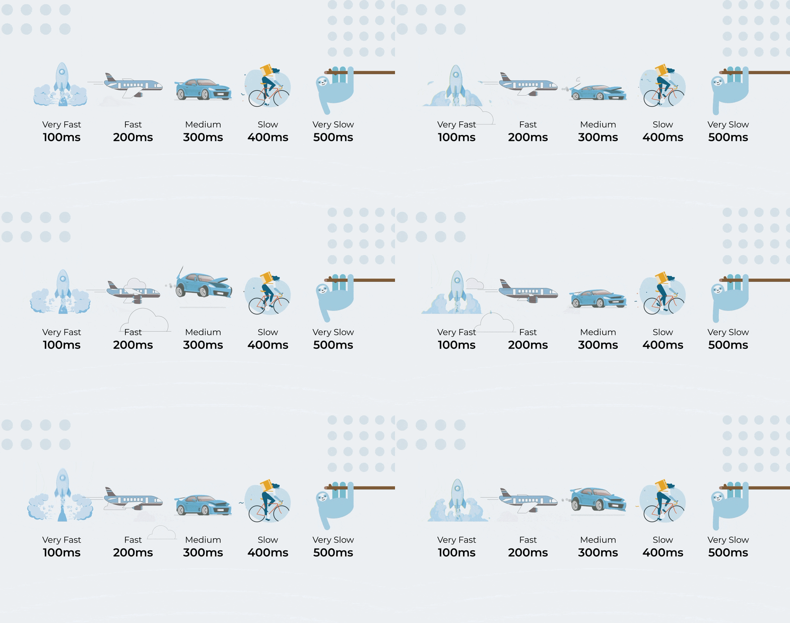
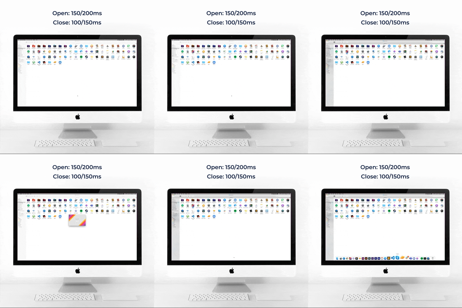
So let’s take Google's Material Design as an example. They use animation speeds between 100-500ms and this range is even smaller on mobile — 100-300ms. Sure, they’ve made several changes in the new Material 3 (You), animations are now much longer, but they are also more complex. Because of this complexity, there are several transformations involved in each interaction, so this is the reason why the total animation time goes from 200ms to up to 500ms in some cases. Yeah, those are some basics, but actually, each interaction has different speeds and durations on different devices. For example, the block entering the screen takes 250ms in mobile apps; the same interaction on tablets is 30% slower (300-350ms), and on a smartwatch, it’s 30-50% faster (100-150ms). Note that this applies to scale- and position-related animations, but for the icon and some other micro-interactions, speed is a constant 100ms on every device. The reason for that is simple — the bigger the screen size, the larger the distance an object has to travel.
Let’s get back to the main topic:
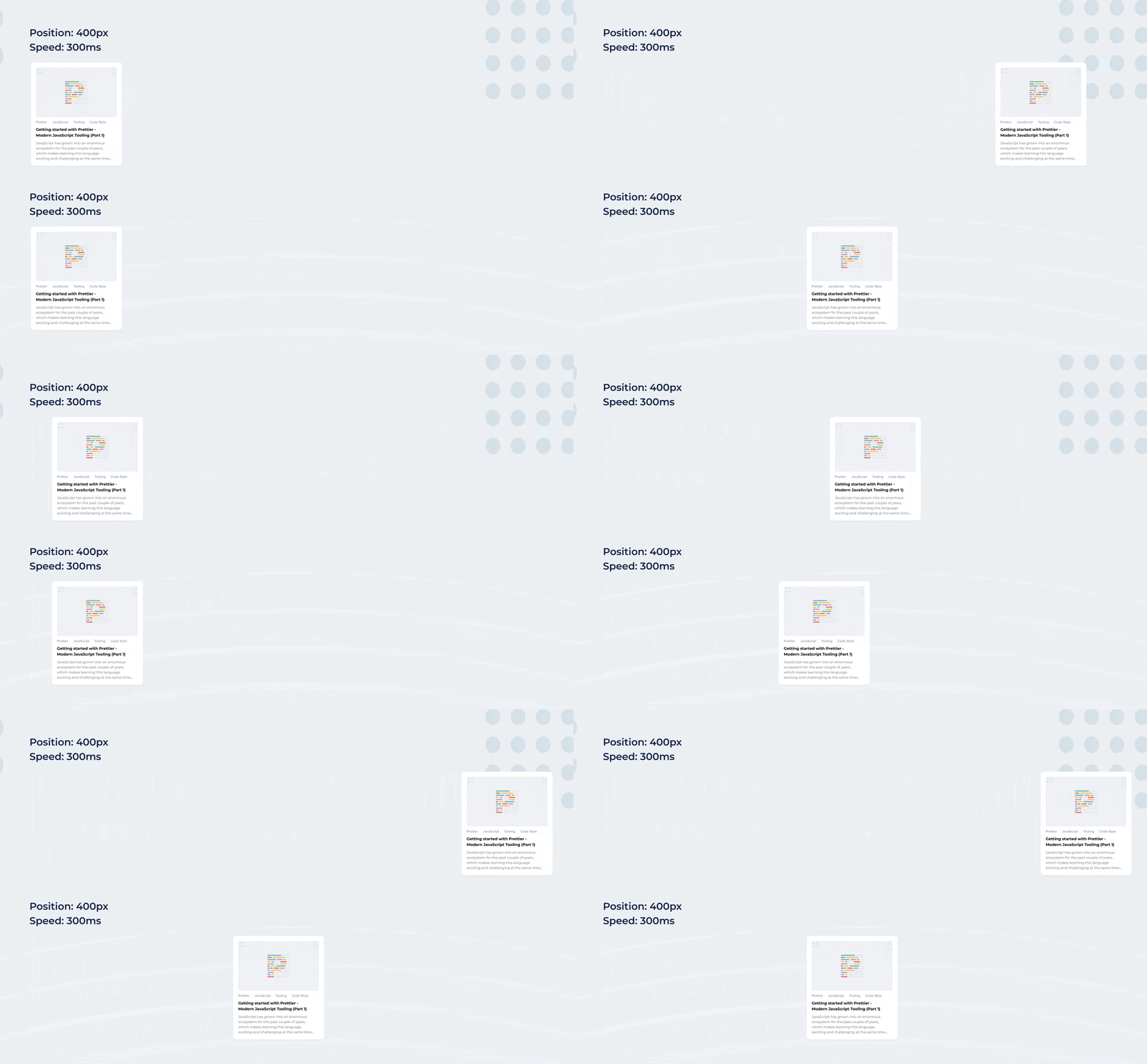
The first rule of interface animation is that animation speed increases proportionally to the distance. So for example, a 100px block has to travel for 200px and its timing is 200ms (traveling with 1px/ms speed), but if the travel distance is 400px, the timing won't be 400ms, and the speed will be accelerated and the animation will take about 300ms (so the speed will be 1.5px/ms in this case).
Animation speed and duration don’t depend on only the distance, but also on object size. Smaller elements are faster because they move more in an empty space than the bigger ones. For better visualization see the image below:
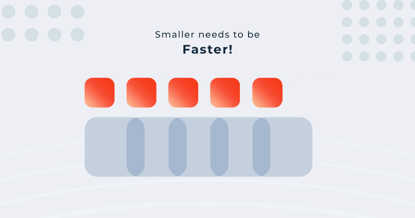
In general, the motion blur is used for a better and smoother animation, which adds life to the animation. But this is not the case in the interface animation. The animation is driven by the user’s action, aimed at increasing engagement and attention, motion blur will cause the loss of focus from what’s changed. Plus it’s hard to implement.

Everything in digital is inspired by the natural, physical world. To make the animation feel non-mechanical, but smooth and pleasant, it needs to have some kind of speed changes (i.e. easing). Easing gives movement (animation) a natural feel and connects it with the physical world. This is one of the main principles of animation.
There are several types of easing and I’m gonna discuss some of them below:

The motion is linear when the object moves without physical impact (without acceleration). This type of motion is not natural and we don’t see it in real life, so it doesn't look pleasant to the human eye. We can use this type of animation only in cases when we need some static motions, like loaders, in other cases we don’t use it in the interface.
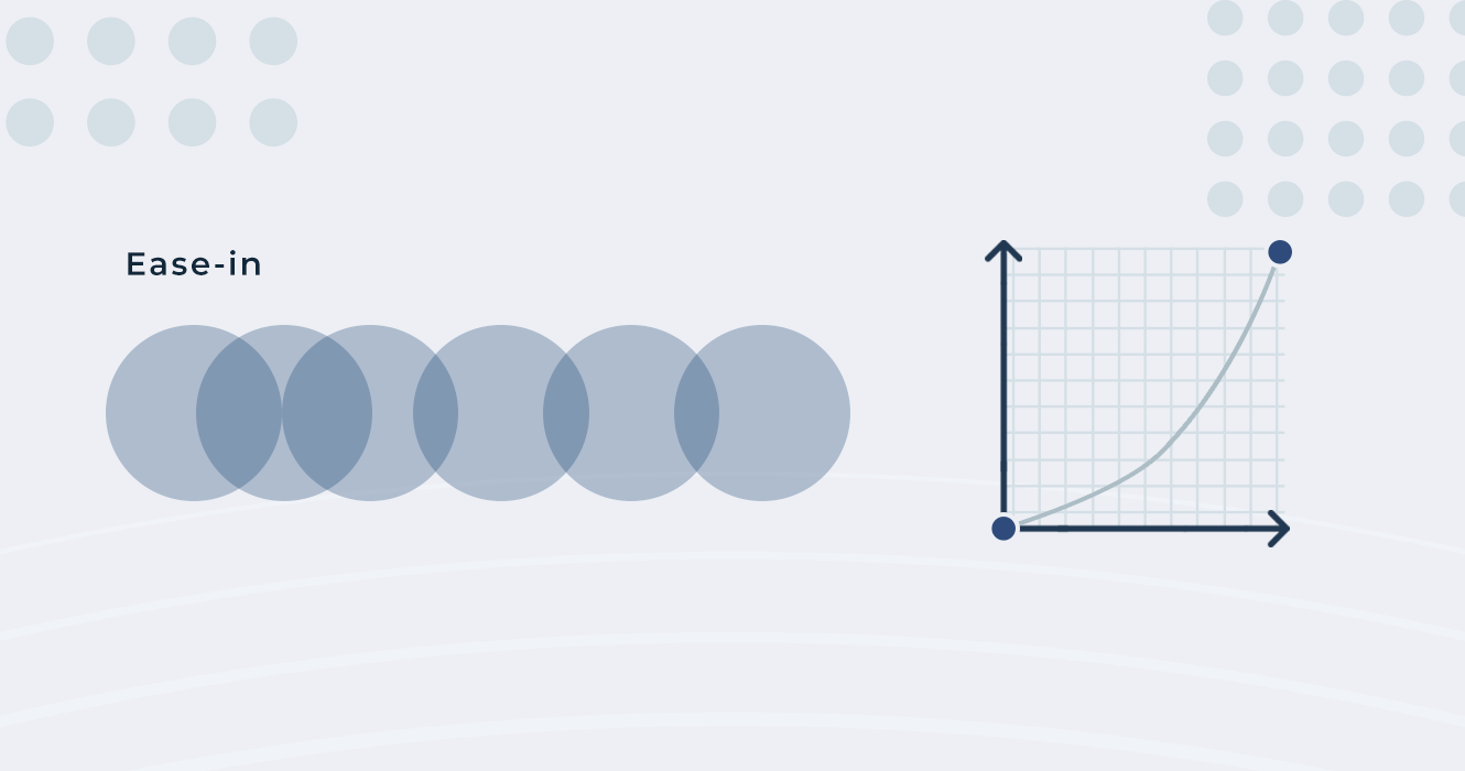
In this case, the object starts moving faster, but decelerates and becomes slower to the end.
We use this type of animation when an object/card is moving out of the screen and it won’t get back on the screen, so it’s for outgoing animations to get the user’s attention and show that this object is going and won’t return back. We don't want to bore the user, because they won’t have more connections with this card.
The main point of animation is to make a mood in the interface, even too small changes on the curves can make slightly different animations and interactions.
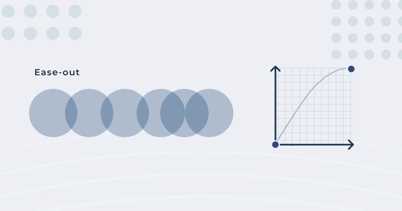
This is the reverse variant of ease-in, in this case, the animation starts faster, and then it becomes slower in the end. It’s mostly used for incoming objects to get the user's attention.
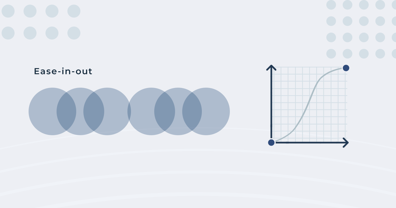
It’s a standard curve, which starts slowly, accelerates, and then continues slowly in the end as well. In most cases, it’s used to get the user's attention on every movement and change. Sometimes we use a slightly modified variant of this motion, which is called an asymmetric curve (it’s a bit faster in the beginning, then in the end, or vice versa).
The choreography is the sequence, formation and continuity of animating elements to give the user the correct focus and to make transitions from one element to another.
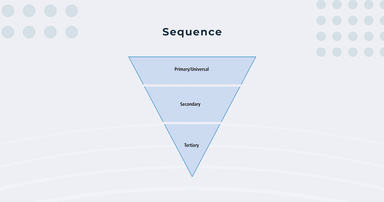
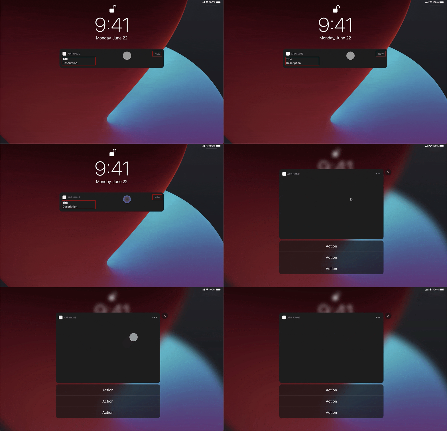
The sequence is an interaction, which shows the user what’s changing during the animation, from the starting point till the end, shows the whole process of animation, how the transition has started, what was changed, how it was changed, and what is the last result of the animation.
1. Outgoing elements - Things that disappear from the screen.
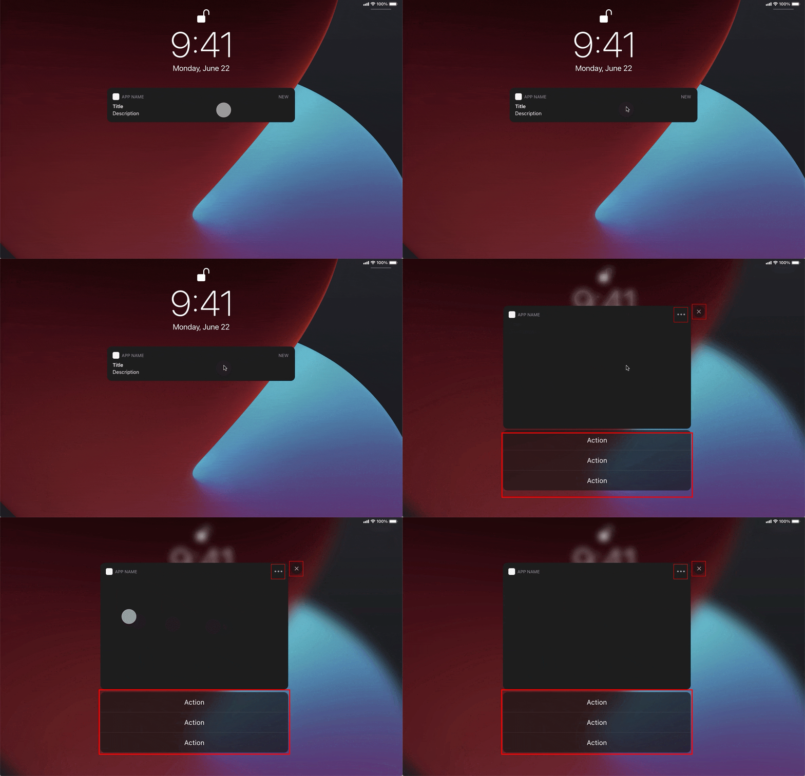
2. Incoming elements - Things that are appearing or incoming on the screen.
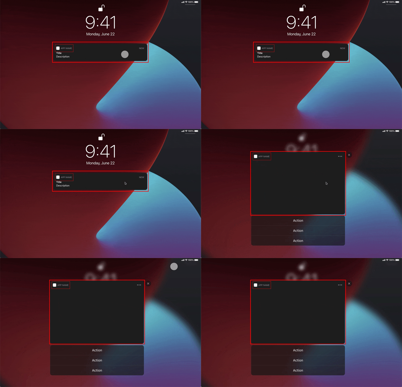
3. Persistent elements - These are elements, which are always on the screen, but sometimes they change shape, size, and position, but they never leave the screen.


Animation needs to be continuous, especially when it’s used on multiple elements (like lists, cards, etc). Animation continuity means that an element starts moving about 50% earlier than the previous one ends, or else the elements will jump around and will irritate the user (unless it’s a case where elements have very fast transitions, 20-25ms).
I’ve tried to write a bit about the animation basics in digital products and if you’ll like it I’m gonna try to write another post about animation, with more detail, about its use in different design systems or devices, about patterns and the best practices, and about its psychological side.
Thanks! 😊
P.S. If you're interested in animation beyond interaction design, go ahead and read an amazing book Illusion of Life by Frank Thomas and Ollie Johnston, key animators at Disney during the Golden Age of American animation. There is also a short video based on the 12 basic principles of animation described in the book.

20 July 2022 • 6 min read
It’s really hard to surprise someone In today’s world of UI, especially with user interface animations. Animation is one of the key tools in interaction design, it helps us understand how to interact with interface elements, it shows connections between elements/screens, and it focuses us on changes. Long story short, today I want to talk a bit about 4 basic principles of... Read More

24 July 2020 • 6 min read
Data is useless without proper arrangement, visualization, and tools. When designing data-driven user interfaces, it’s critical for the final product to be easy to act and interact with, to scan and understand the connection with its parts. Every type of data can be hard to visualize, but large datasets in enterprise applications are especially complex to break down... Read More