
NBR.ge is an e-learning platform focused on English language video lessons. Platform is made for the famous Georgian American English Professor, Nugzar B. Rukhadze personal learning course. We’ve made this course like it is P2P, like you are on the lesson personally with your teacher, progress and profile based notifications and tips from the teacher (lecturer), plus interactional video lessons with optional check for understanding type quizzes after lesson sections.
From the very beginning, stakeholders had an idea to create a really weird desktop application and the main reason was that, they were afraid that people will steal video lessons from their platform and upload on the internet. In this idea, there was a very tangled flow for the user to view video lessons, for example, first user had to download and install desktop application, then register in the app, app had to track user’s IP address, after that it had to generate some kind of transaction key, which user had to use to make a bank transfer to company and after that (about a day or two), platform administrator will give this user access to view video lessons, but that’s not the end of the flow… user only could view videos sequently, without rewinding or replaying video, also if application saw any screen recording software or/else user logged in from the different IP address than user had during registration, app had to block video lessons and give user warning. So the main problem and challenge was to explain to those stakeholders, that this kind of restrictions won’t work, it’ll only make them lose potential users and also can’t handle that “stealing” thing, because that kind of user will always find a way to do that, so instead of restrictions, platform has to give user more than the video lessons, to give users benefits to pay for the actual product. Another huge problem was the design language of those video lessons, they were like school prom videos from 80/90s.

When the client company came to me, they said that they wanted just a landing page for the desktop application I’ve mentioned before, but when I’ve listened to there ideas, I decided to work with them to create a good products and not just a landing page for a product, which no one will use. So I’ve tried to explain to them, that course should give users more, than just a video lessons, we have to help users to actually learn a new language with not only videos, but with other learning tools, so that users will pay only in this case, so I’ve attached another role in this project, the BA role, and we made a platform, which can give you more then just a video lessons, we made several benefits, like tests, teacher/student interactions, etc. Also after seeing actual video lessons, as I mentioned before, they were like 80/90s prom videos, so I’ve also offered them to use my Art Direction skills as well to make them more pleasant to view, more fun and colorful, so actually in this project I had several roles, such as BA, Product Designer and Art Director.

After several meetings, we’ve agreed on product basic requirements and created a document where we had all the business needs and requirements, after that I started to find the design style for our product and this journey I’ve started with landing page design. So the main goal from this point of view was to make clean, modern and colorful design, because most of the users will be young students, who want to learn or improve their English, so I’ve made 2 design versions (one cleaned and second one more colorful). The first version was selected, so I’ve continued working on this product with selected styling.


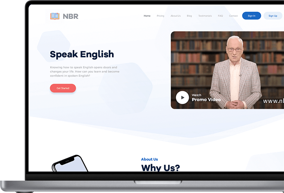
After selecting a design version, after we’ve agreed on a design style, made some improvements and adjustments on the version and after several iterations here is the very last landing page design.

How I’ve mentioned before, visual language of the video lessons were like 80/90s prom videos, so after we’ve agreed on the design style, the first thing I’ve started working on was these videos, I’ve tried to make them look much cleaner, modern, easy and nice to view with minimal changes. I’m not going to be boring and write a lot about those changes and I’m just going to show several “before and after” examples:


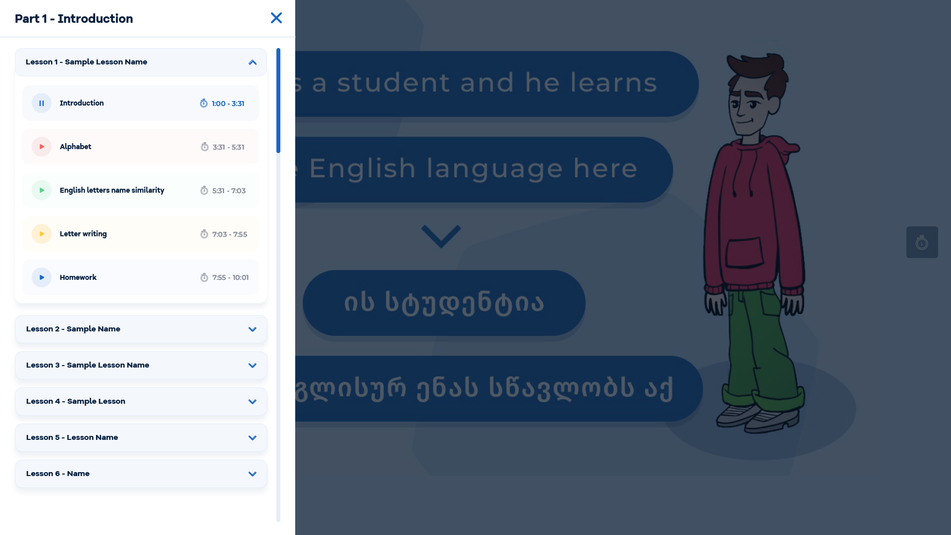
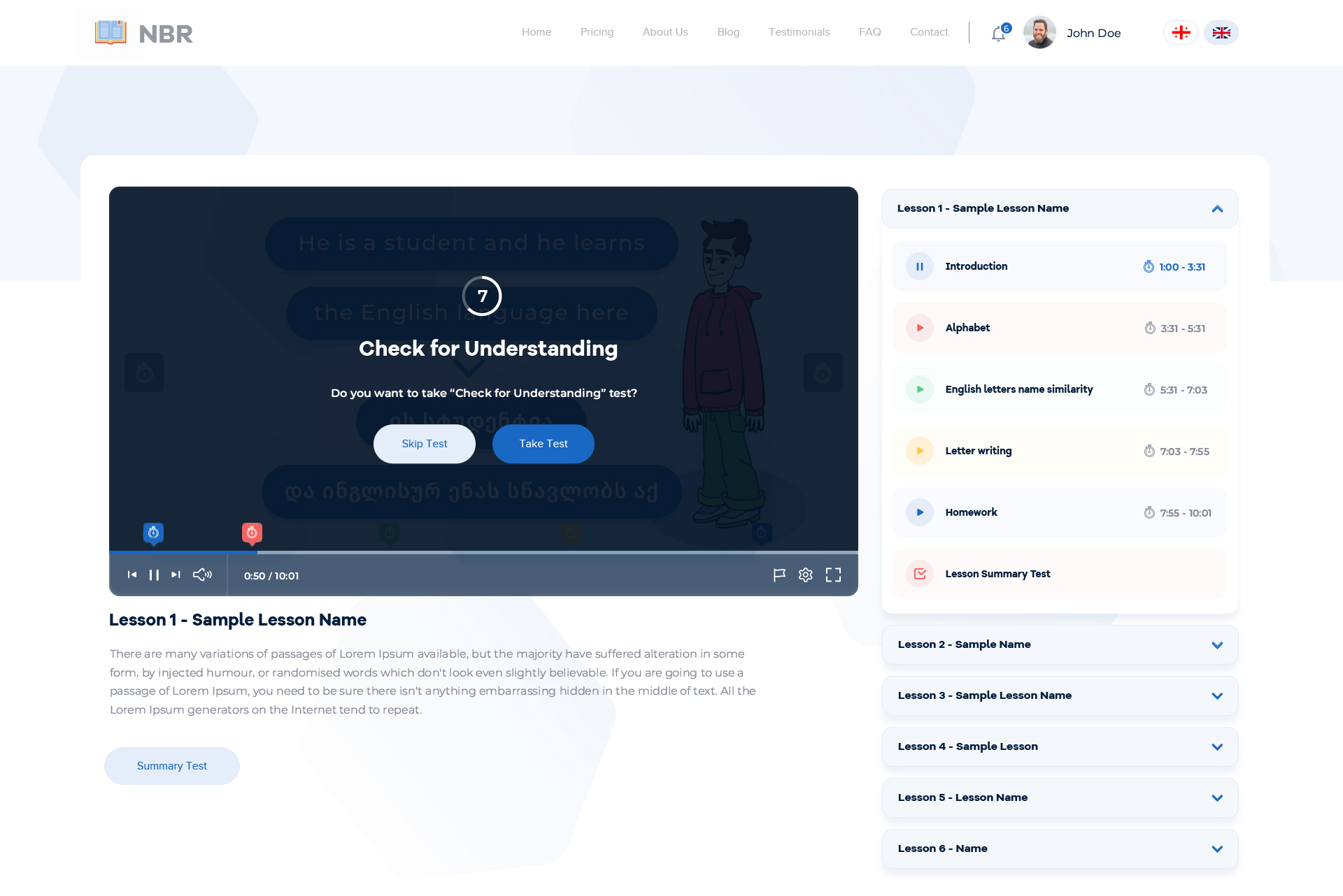
After we’ve agreed on the design language and updated video lessons visuals as well, I’ve started to work on the learning path and process, because as I’ve mentioned before, it’s better to attract users with benefits, which pirate content can’t give, to make them pay for your product, not to chase and restrict them, because of the fear of “stealing”. The first thing to do is that user needs , pause, continue, replay and rewind actions, because in 99% of cases no one can learn anything in one hearing. Also, when I was working on the video lessons visuals, I’ve noticed that each video contained several themes, so we could cut down the lesson to several mini paragraphs, so user can loop a theme or jump from one to another with shortcuts when needed. We’ve discussed what else we can give the user on this learning path, to make it easier and give them the best experience from these video lessons, so we’ve created another two engagement benefits, now user can have a quick video/text chat with the teacher (Mr. Nugzar), also made several exercise types for better learning/understanding and group them under 3 main types:
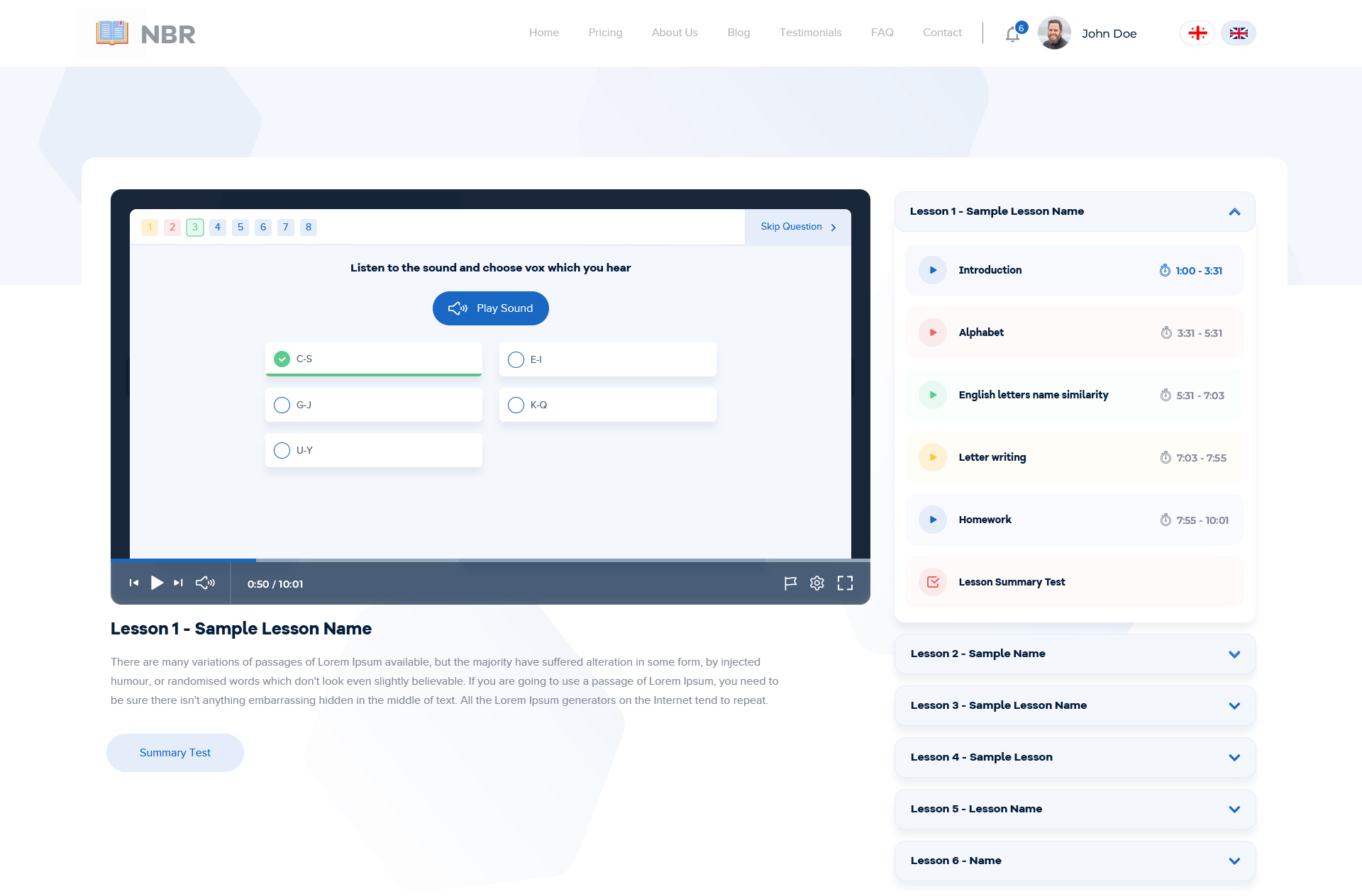
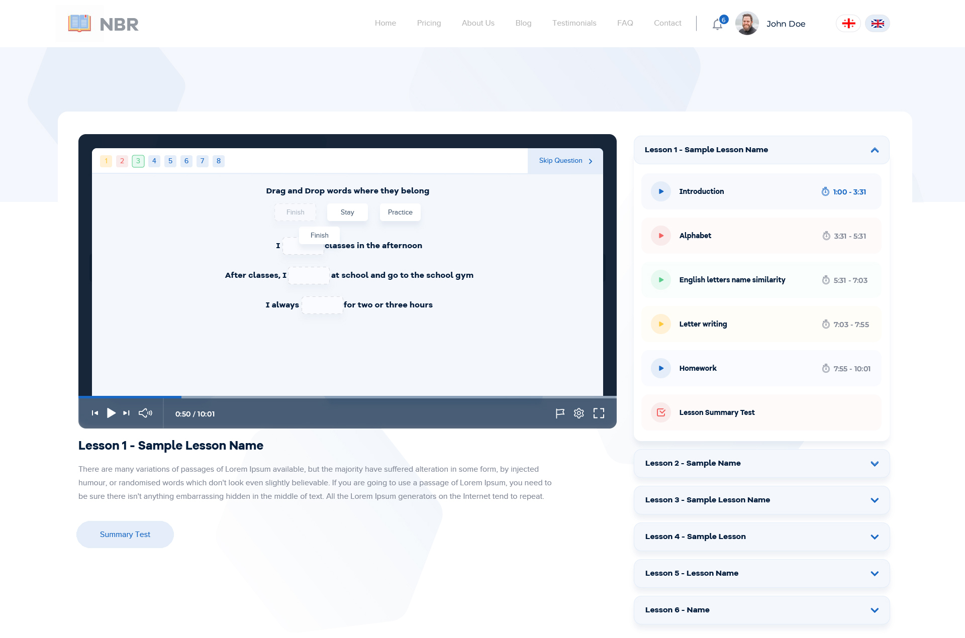
Long story short, each test group contains sets of several different test types, for examples we’ve: multiple choice, re-align, listening, fill the sentence, word matching, spelling, etc. After each answer platform also shows the correct answer (when user’s answer is wrong), because this platform is not for the some kind of challenges, the main idea of this platform is to give the user actual knowledge. In the end of the test, user can see the summary of the test, statistics, in what kind of questions and which paragraphs user had incorrect answers (so they can work on that points) and also an ability to take the test again or review lesson paragraphs where they had the most incorrect answers. Here are some design examples of the video player, tests and shortly learning path.

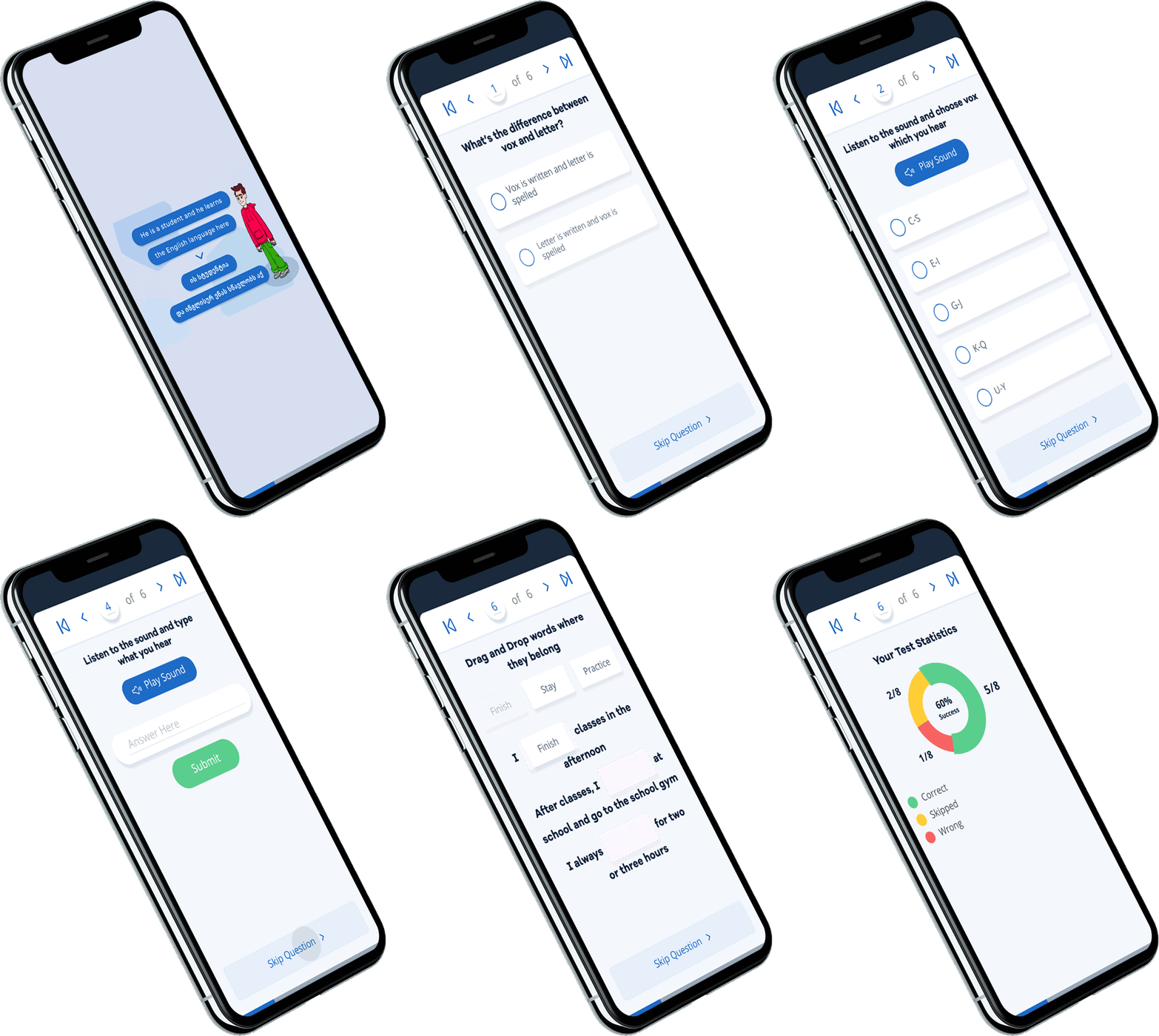
Nowadays as we know, 60.9%(!) of the web traffic is from mobile devices, so it was also important to make the platform responsive, I’m not going to write about the platform responsiveness step by step in this case study, but the main challenge was in the actual learning path, mostly tests, so I’ll just show a small animated gif which shows the testing flow on the mobile devices.
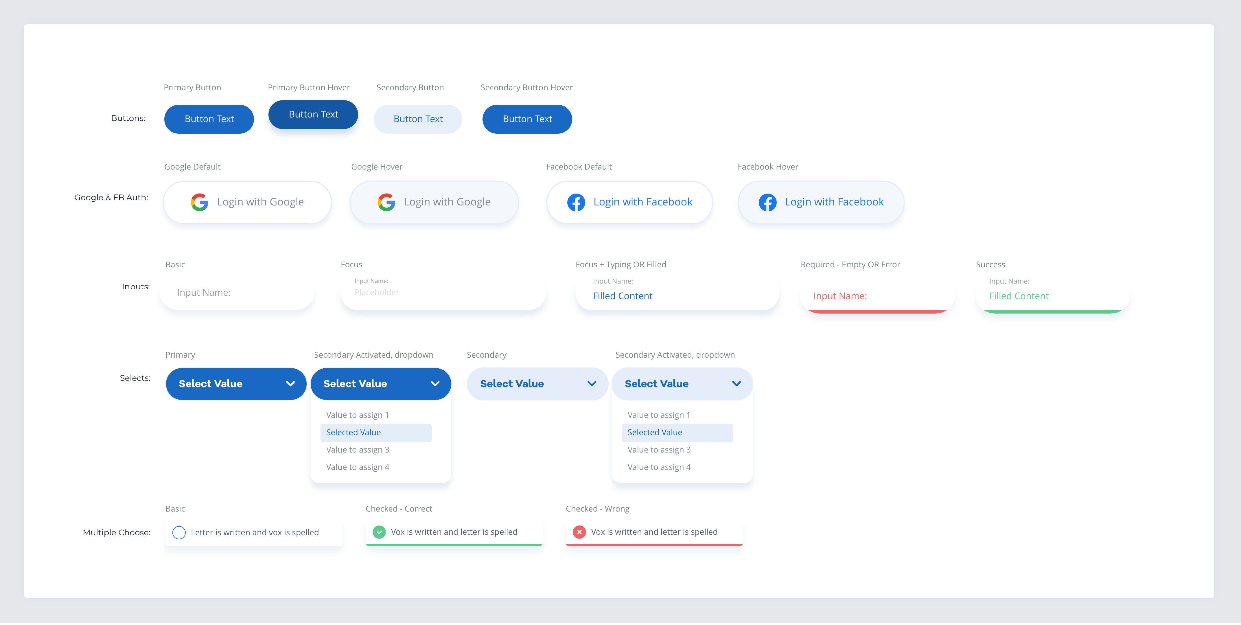
We’ve selected blue as the primary color of the platform (as it’s a color of the stability and peace) and as the secondary color, we’ve selected its complementary color red (as the color of courage, love and joy).

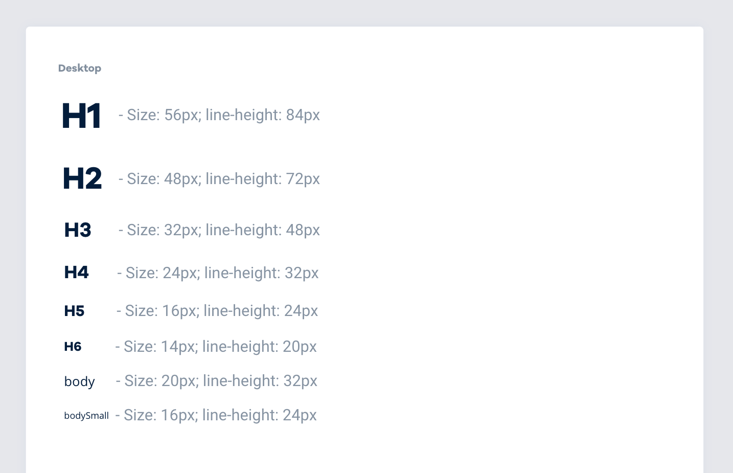
Open Sans was selected as the primary font-face, because of its good readability even on the very small sizes, its simple glyphs and the open source license, but for titles we’ve selected Galano Grotesque Bold, because of it’s elegant, clean and pretty glyphs.
