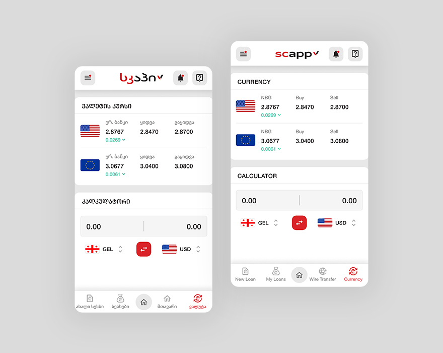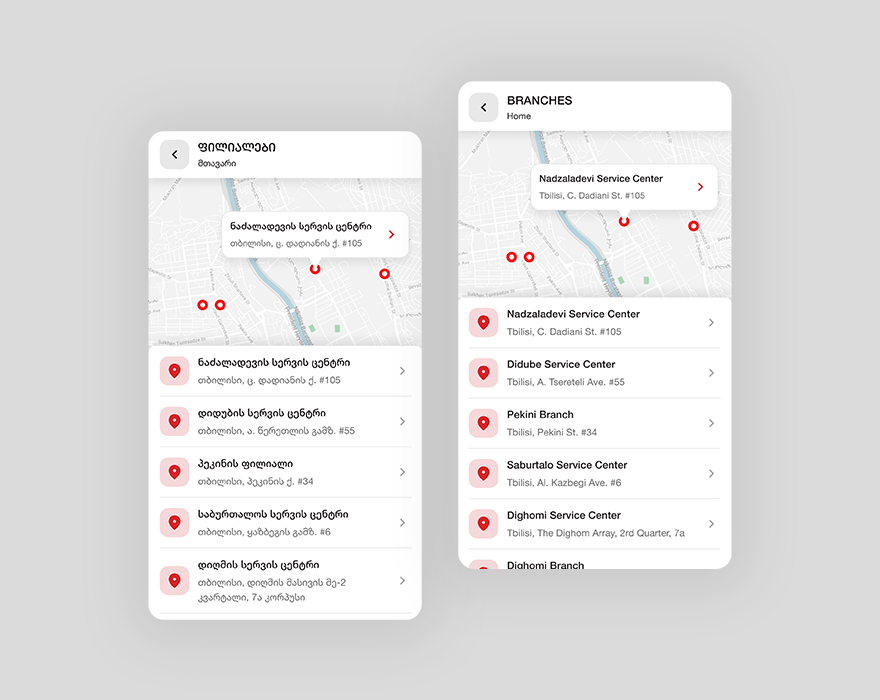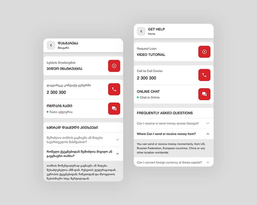

This isn't project's full case study, because of the NDA.
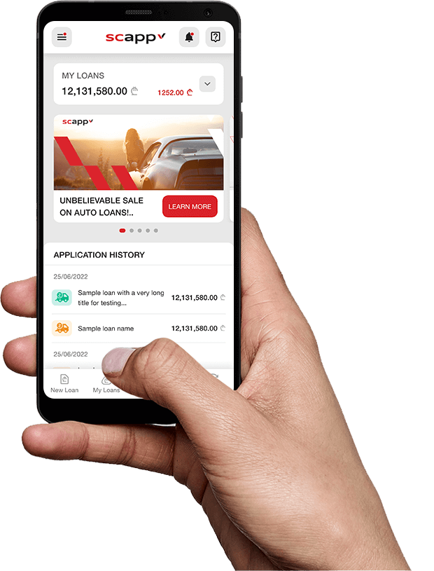
Scapp is a mobile banking application, which will make easier for Swiss Capital’s retail and business clients to manage their loans and products, to give personalized offers and also to attract new clients, etc.
The main challenge was that, this app had to be available on the both major platforms (iOS and Android) and also to have the same design on the both platforms, because it was going to be developed in flutter and then packed for multiple platforms, so design had to be customized for the better experience, had to find crossing native functionalities and behaviors, so the app will be native and easy to use for app users on the both platforms.

I’ve joined this project team as the Product Designer, where I’ve tried to make Swiss Capital digital products adaptive for mobile application, ease user journeys and to make the application easy to use.

*Originally application design is made on Georgian language, because of that, to show the original look and feel of the application, in this case study, I’m going to show designs translated to English side by side with the original ones.
On the very first view, client wanted to focus users attention that, this application was microfinancial bank Swiss Capital’s and not the some kind of standalone application.
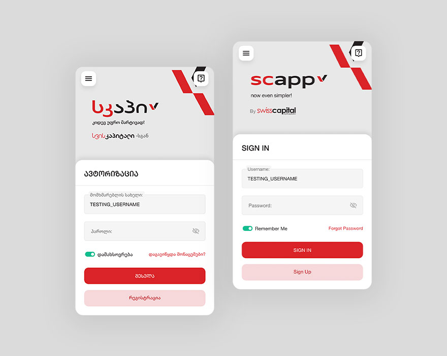
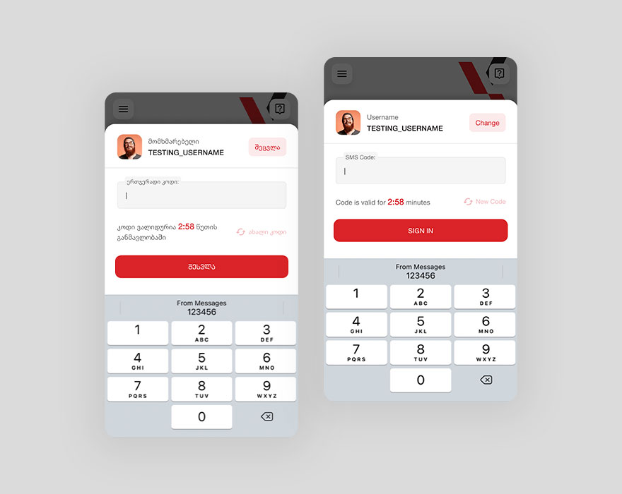
As this application is financial type app, instead of just basic authorization, user also has to validate/authenticate login with SMS code, sent to the registered phone number.
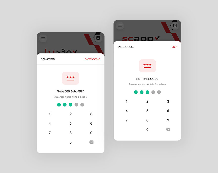
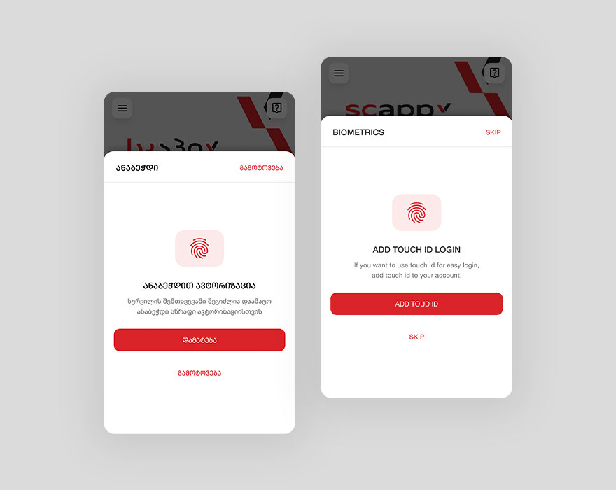
To make it easier for the user to log in to the account, also added PIN and biometrics authorizations as well.
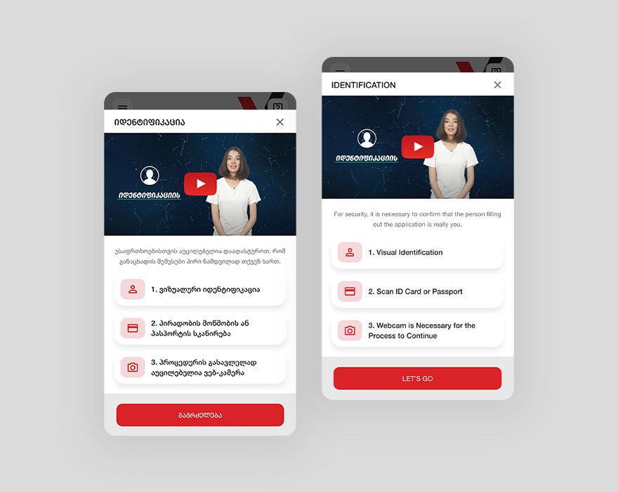
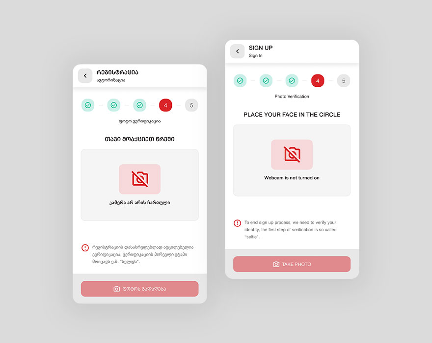
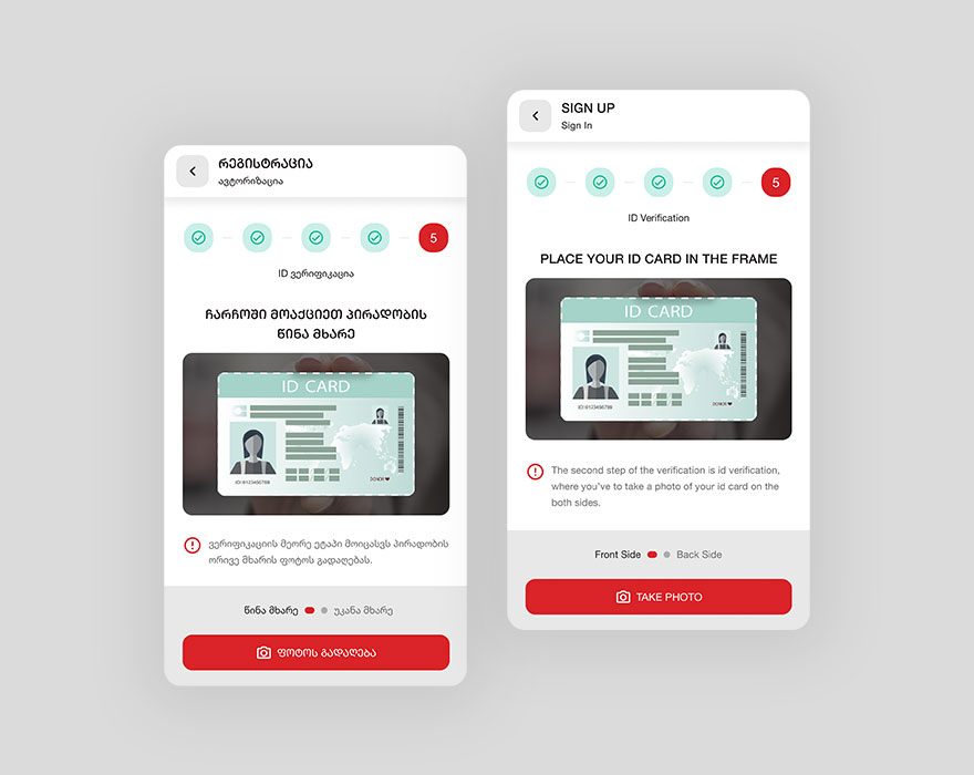
In the Sign Up flow, the main challenge was that, this application was for financial operations, so we had to restrict users with creating fake accounts or with someone else’s credentials, to manage this thing we needed to have an AI model in app, which will work on the person identification, for this purpose was selected Kvalifika’s AI product for online verifications.
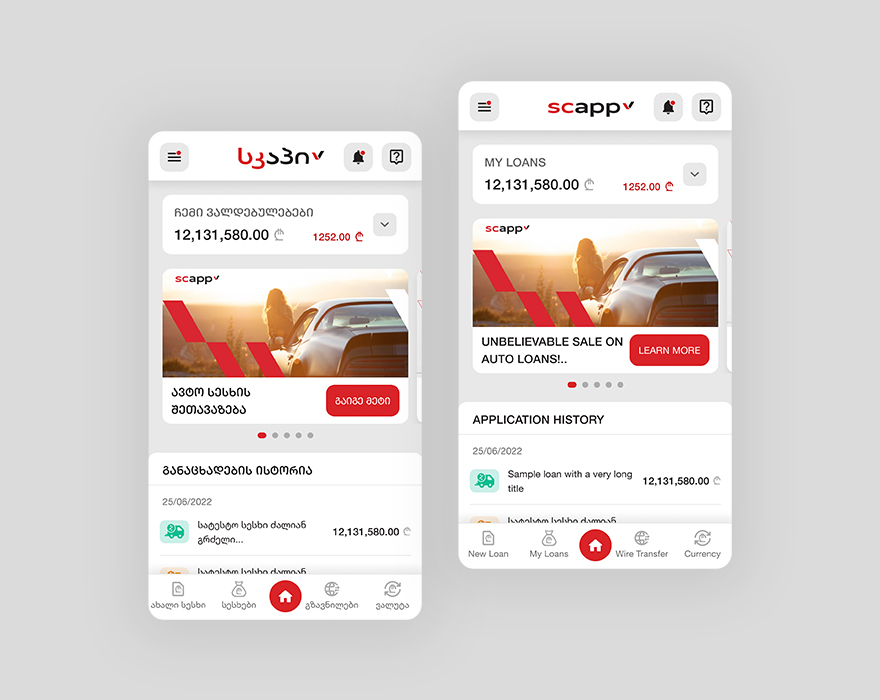
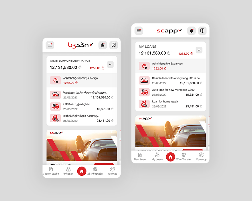
After signing in, user lands on the dashboard page, where users can see the total amount of the loans they have, they can also expand it and see all the loans in details. On this page, user also sees personal offers in slider view and transactions/applications history as well.
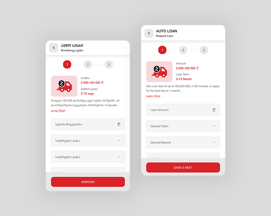
To make it easier for users to request a loan, I’ve divided the form on several contextual steps, to make the request flow faster and easier, also user can stop on any step and just close the form, but the information user has filled before will be saved and they can continue anytime from where they’ve stopped before. I’ve also divided product details page contextually as well, to make it easier for the user to find the desired information.
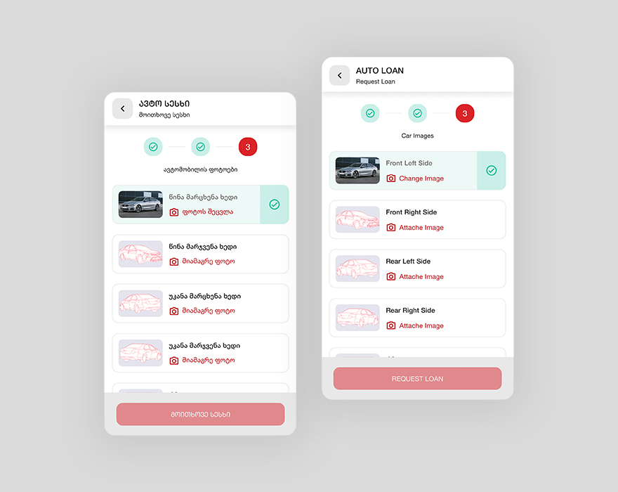
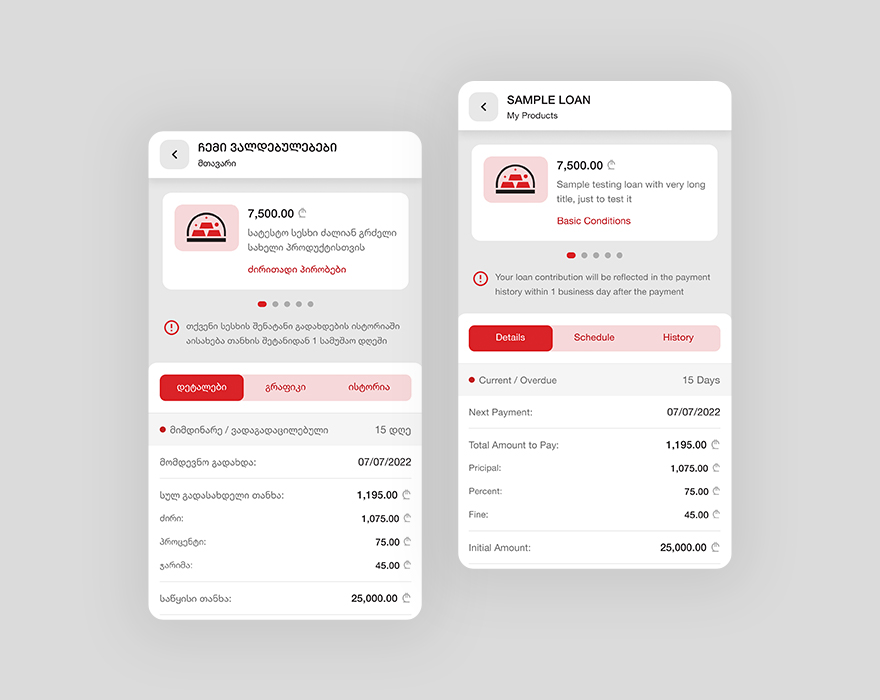
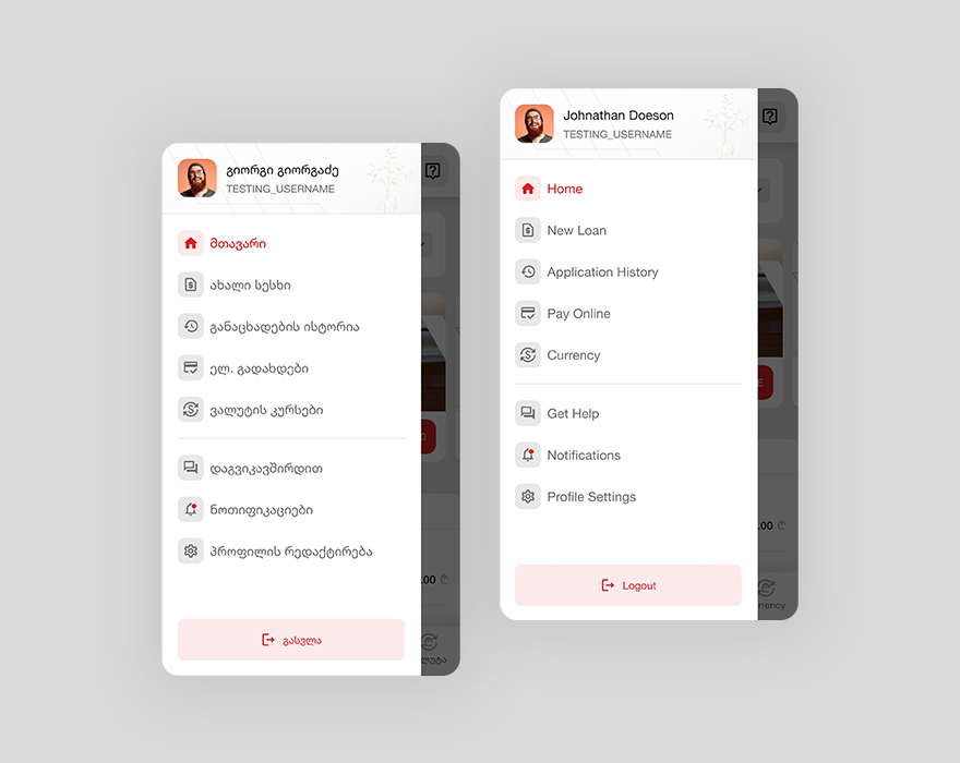
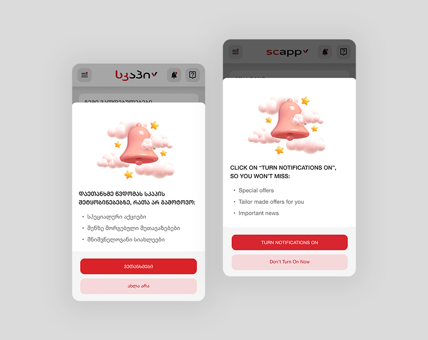
This application also has several pages, which makes experiences easier for the user, here you can see several examples of those pages.
