
This isn't project's full case study, because of the NDA.
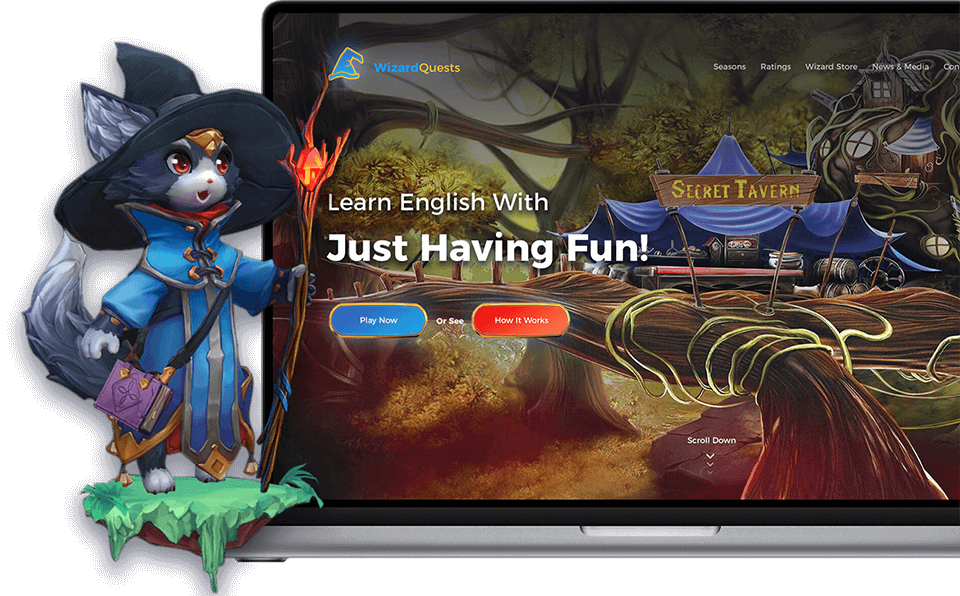
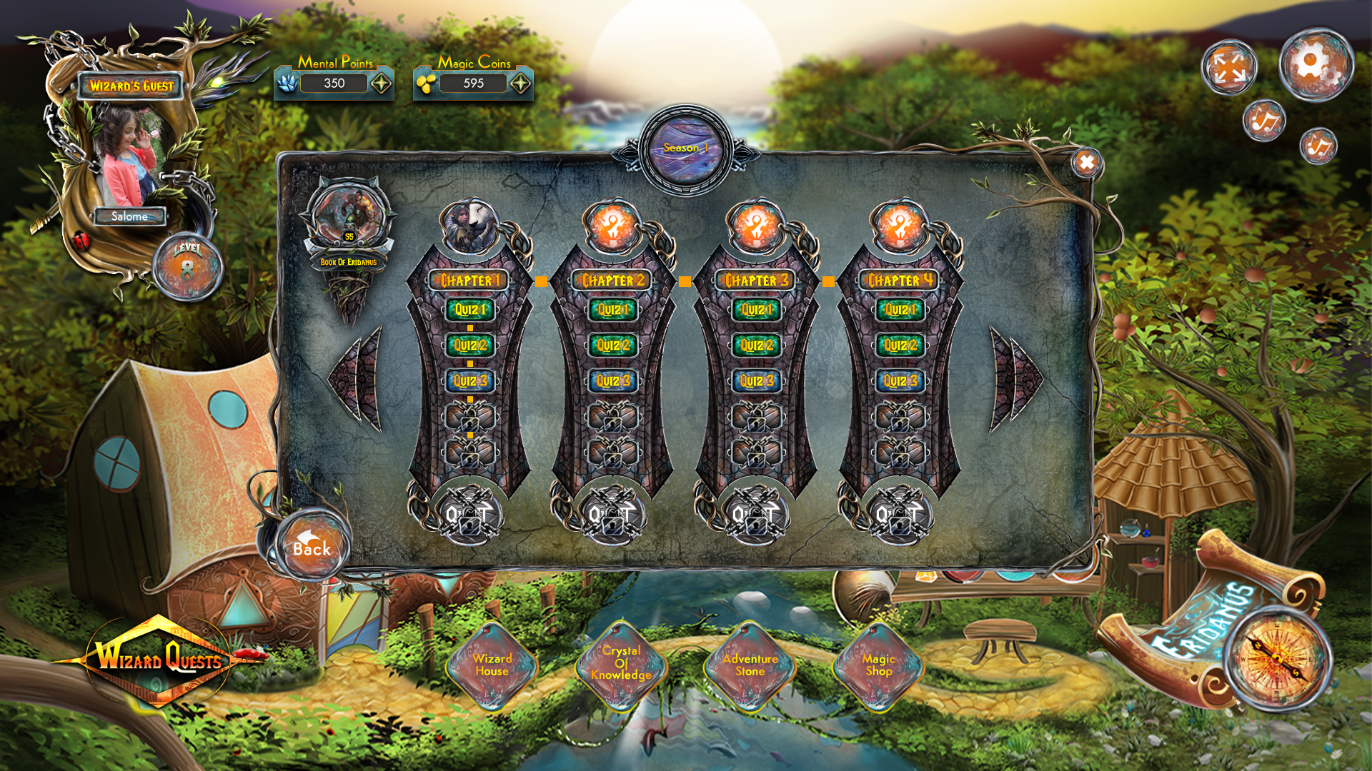
The project failed on the first try because it had some fundamental problems, such as complicated sign in/up flows, external clicks and too much steps for selecting quests and starting to learn. As you may guess, platform was created specially for school children, especially for the school kids and design language of version 1.0 looked like a slot game, so parents had a huge trust issues.
This was the very first gamification project for me, so there was a lot of challenges and a wide sea of new things and experiences. Along with this, it was the first project for me where I could research and test experiences on 30k+ current/former users, process such an amount of data, work and improve the user experience backed with data. It was such a pleasure and pride for to work on a product, which will not only makes learning process easy for kids, but also makes it fun for them, to give them fun learning experience, thing what my generation didn’t have, also to show people that games can be useful and not only a time spending experience, to show that everything in this changing world has it’s due date, that time of learning methods schools use now has gone and we need re-invent and reform it.

As I’ve mentioned before, first version of the project has failed because of reasons mentioned above, so after that, I’ve joined Play2Learn team as a Product Designer. My role as a Product Designer was to create easy, comfortable and intuitive platform, which will help school kids to learn various subjects by just playing games.

Working on this project, I’ve started with researching and analyzing problems around the current (1.0) version of the project, even with the first glance, it was obvious, that one of the core problems was it’s visual style, because it was very alike of slot game and was causing trust issues in kids parents, also it was too messy and overloaded, so it was too hard to focus on data even for an adult, not talking about the school kids. Also design’s styling was going into the “dark fantasy world”, but I thought that kids of this age will like lighter fantasy world more than the dark one and as the next steps of research will show, I was right.
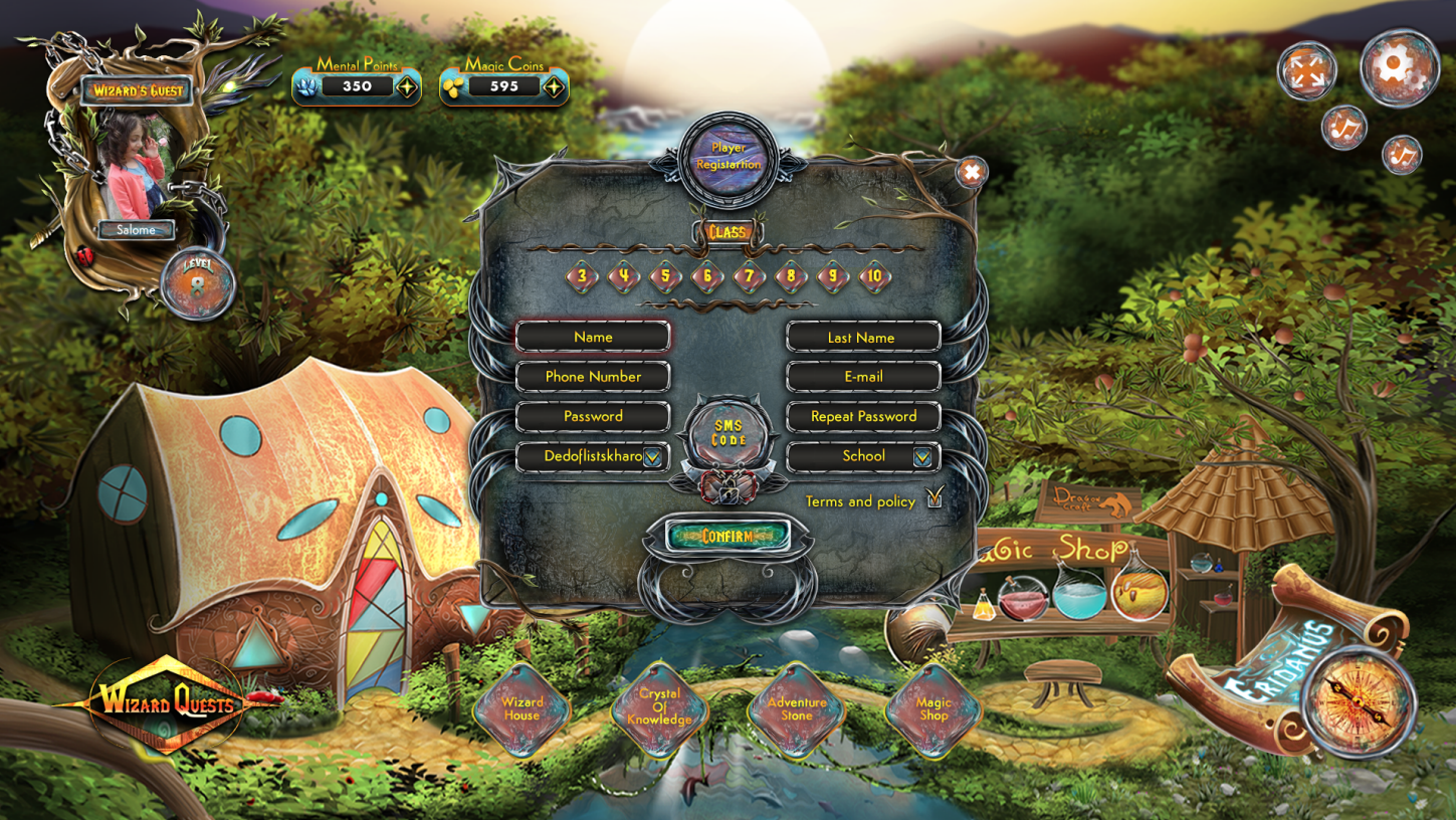
As I was working on the project redesign and the 1.0 version was already tested by the real audience, after marking several core problems, I’ve looked and analyzed Google Analytics data and noticed (not surprised), that user the biggest user drop rate (76%) was on the registration page. To use platform, user has to register first, the current form was too big, not intuitive and messy, and what about the sms verification, it was not even hard, but it was impossible. So we came with some of the core problems of the platform.
So, as I’ve mentioned above, it was only 24% of users who have registered on platform successfully, but it wasn’t the end of the onboarding problem, because after registration, only 0.3%(!) of users got to the actual questions of the game and another 23.7% of users have just closed the tab, because they just can’t start the game.
After finding the core problems, I’ve decided to research the target audience, to get what type of fantasy worlds kids of this age prefer, how intuitive they were and how easy it can be to push them to the needed actions, to create the best and customized experience for them. So I’ve created a survey, which we’ve tested with the kids of one of the selected the school, here is a slightly modified example of that survey.
>Loading…After finding the core problems, I’ve decided to research the target audience, to get what type of fantasy worlds kids of this age prefer, how intuitive they were and how easy it can be to push them to the needed actions, to create the best and customized experience for them. So I’ve created a survey, which we’ve tested with the kids of one of the selected the school, here is a slightly modified example of that survey.

If it’s interesting, you can view filtered and modeled data analytics of survey on the link below (general view is the same as the original data, just the data is a not original of course). → Spreadsheet Link
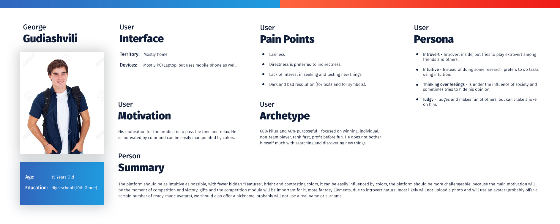
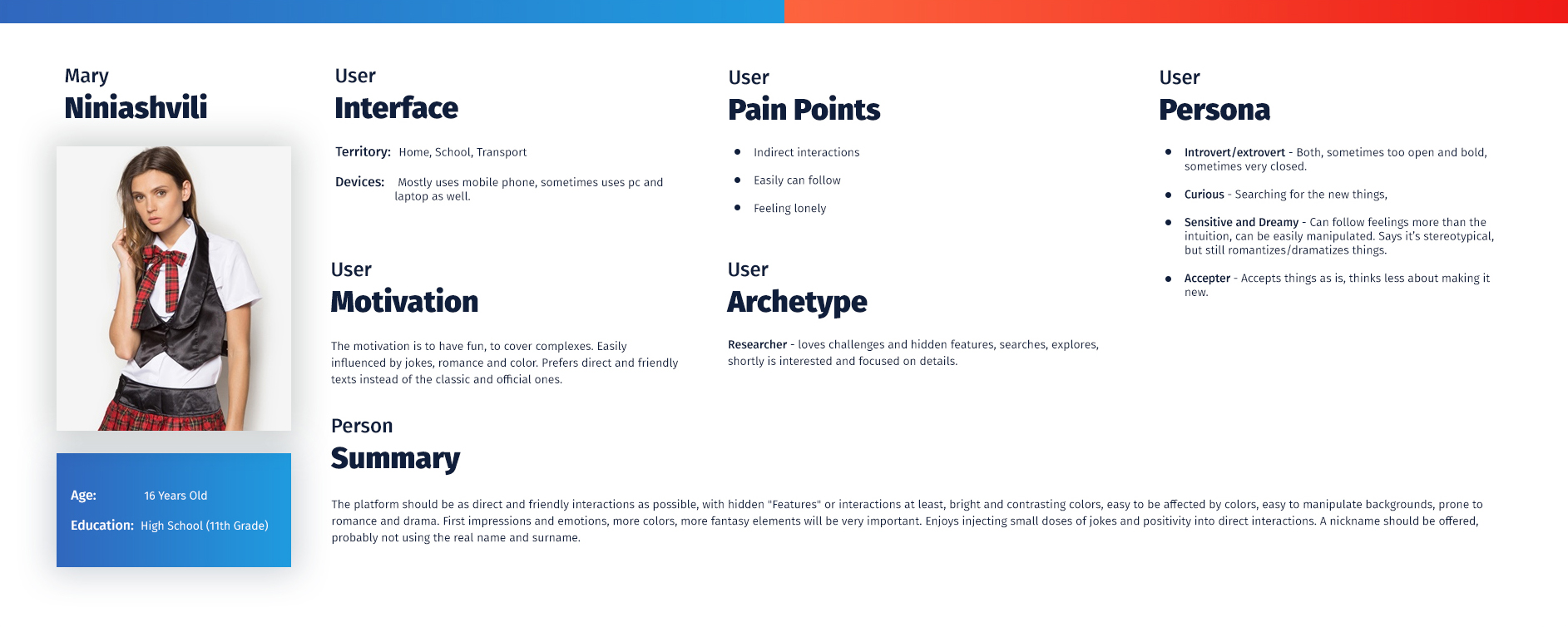
Based on research data (analytic), I’ve created 2 basic user personas: a girl and a boy, psychological portrait of potential users of the our product.
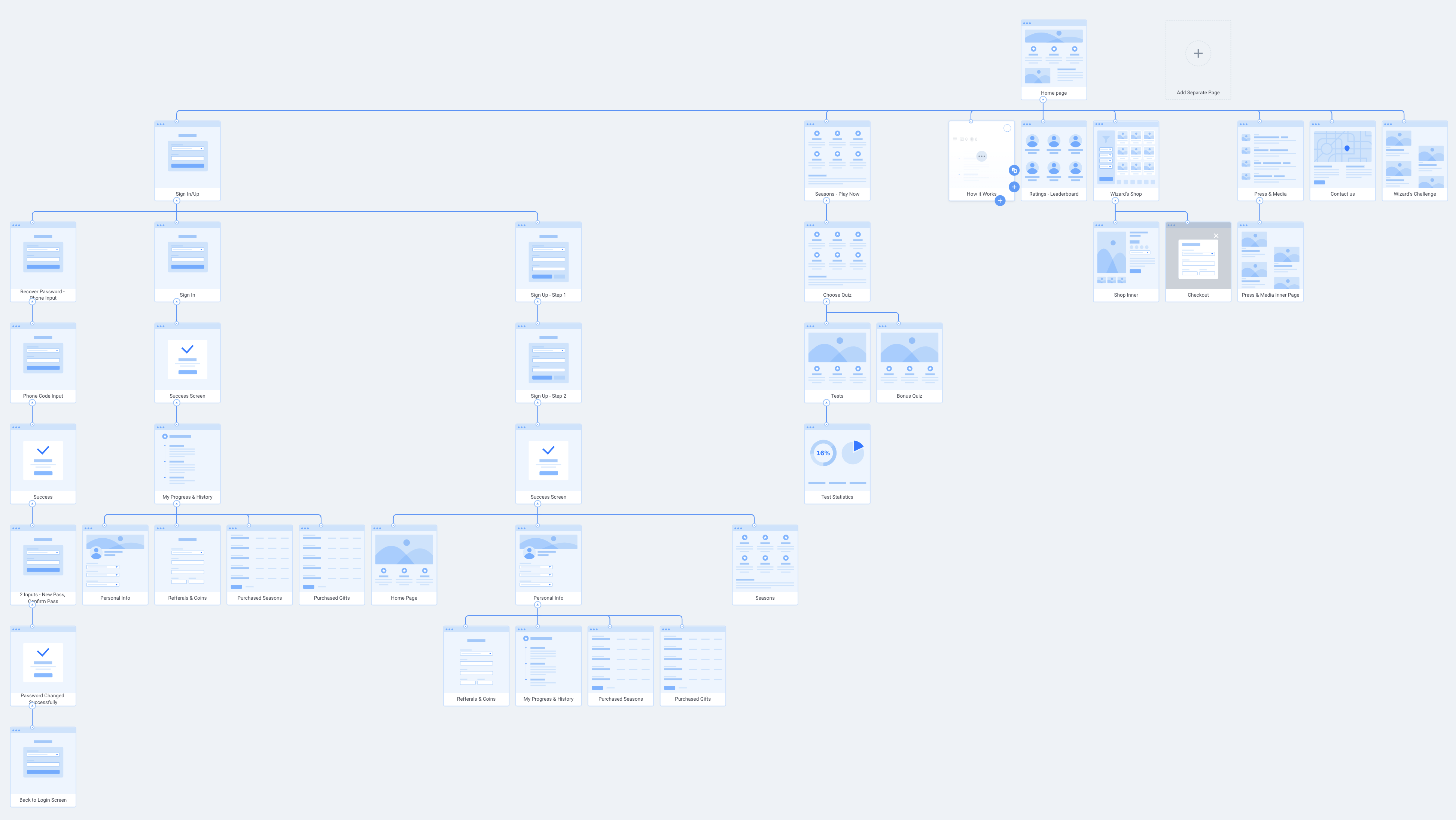
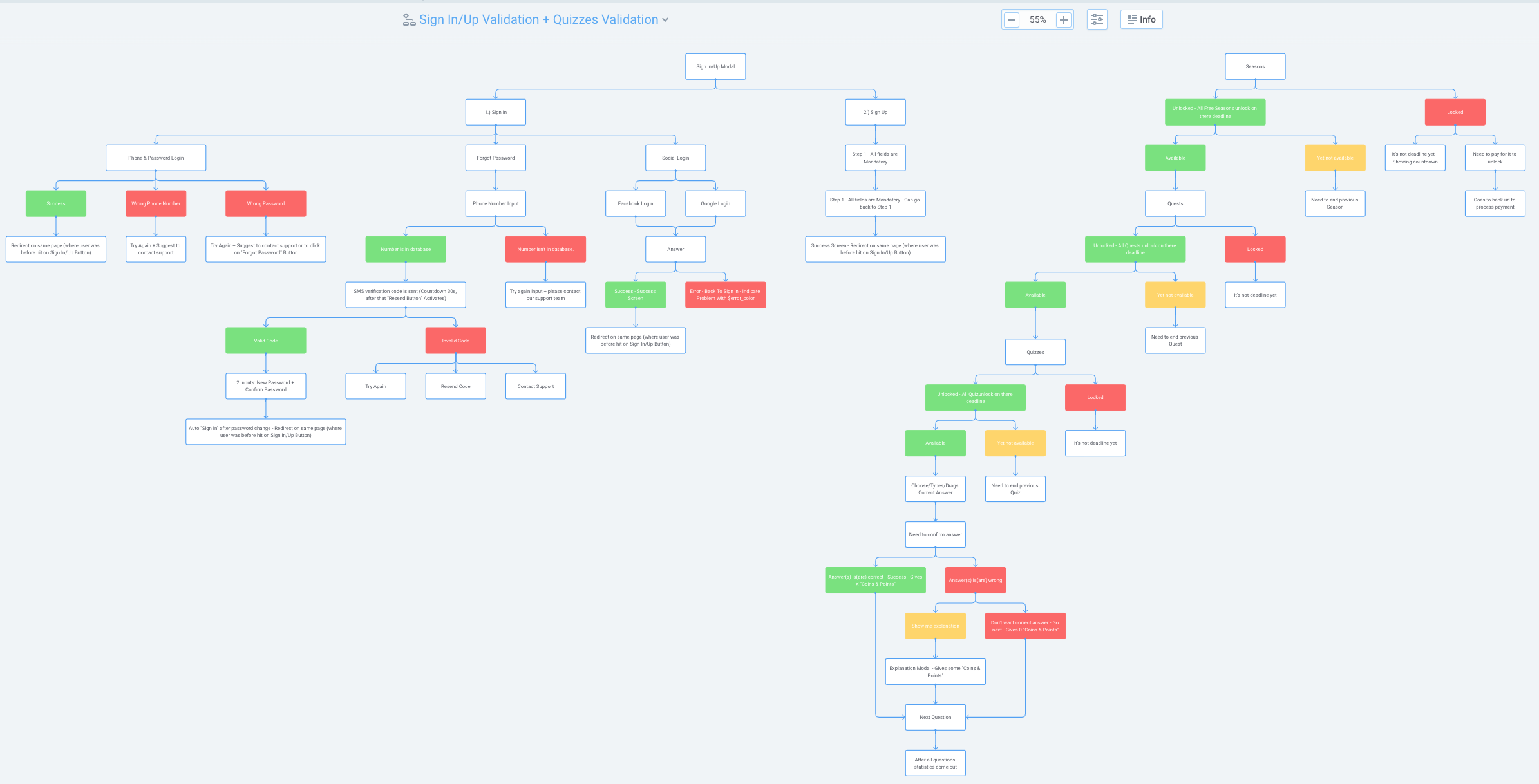
After writing down project’s basic requirements and business needs, I’ve created all the main user journeys and flows of the products, also chunked forms and created validation flows and points for each step and documented it. On the screen below you can see Sign In/Up journeys, form validations and actions.
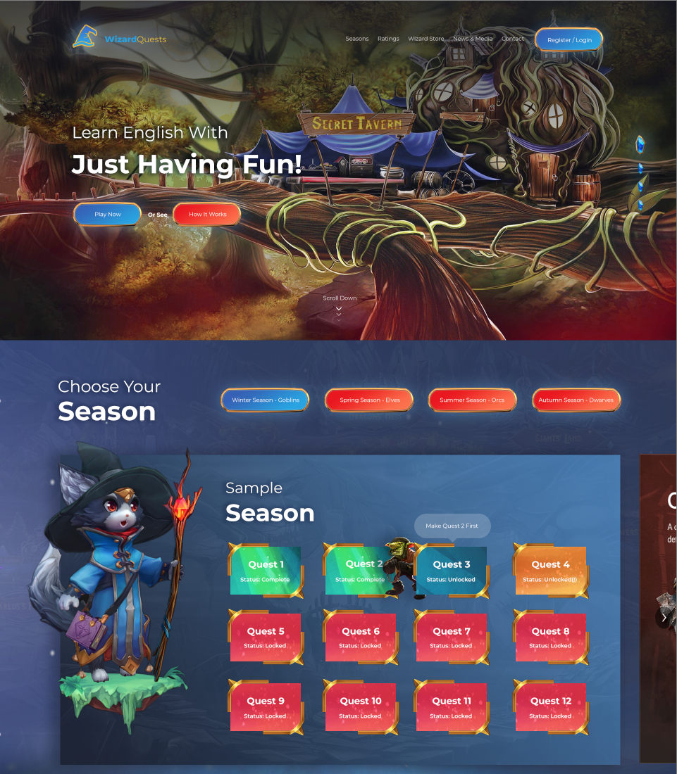
After research and analytical work was done and basic project/user requirements and needs found and documented, I’ve started to work on the design style based on research data and started it, with main (landing) page design. I’ve created 2 versions of the landing page, I’ve showed and discussed it with the stakeholder and the v1 was selected, so I’ve continued working on that.
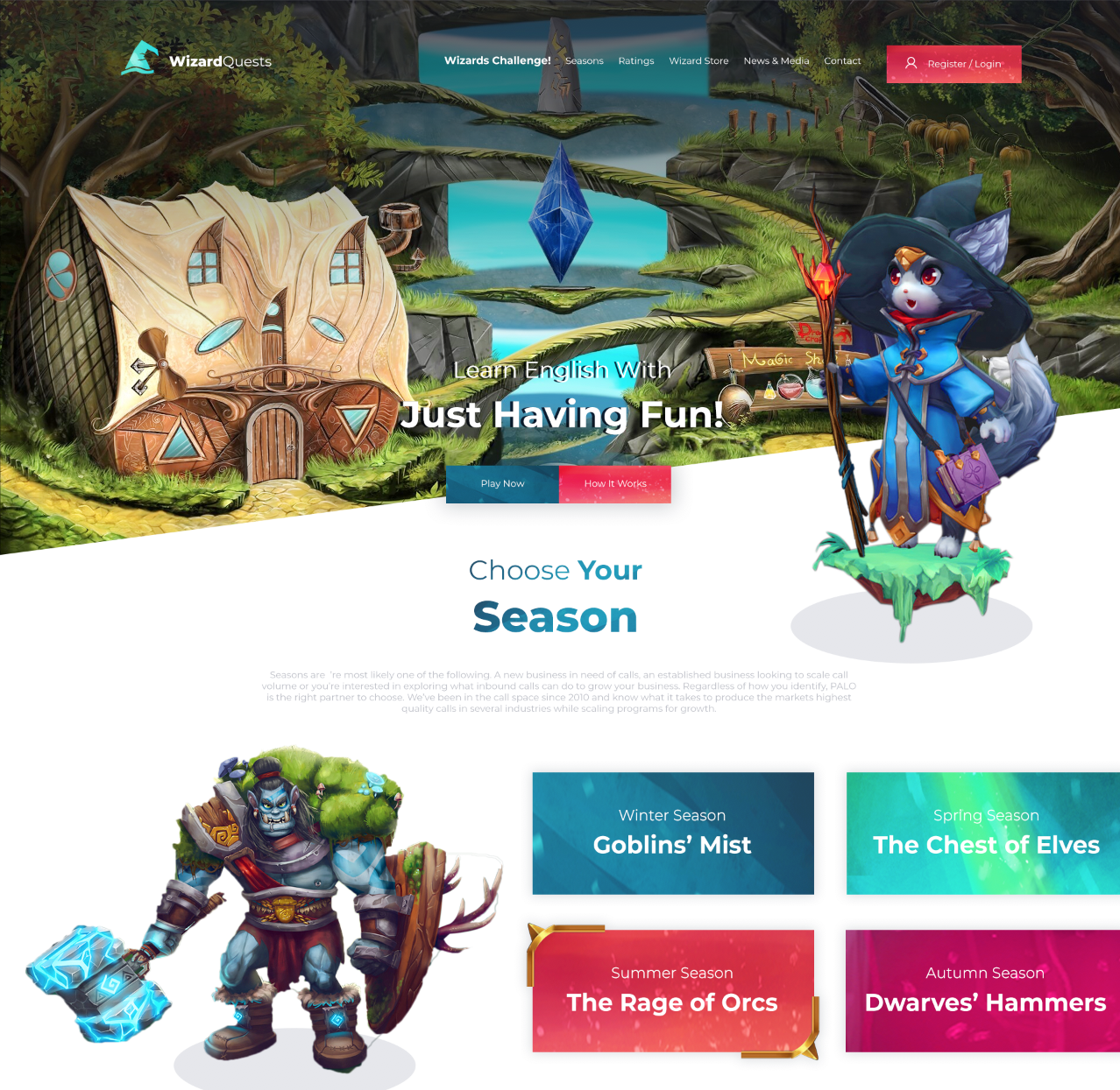
After some work and improvements on the landing page, here is the last result of it.
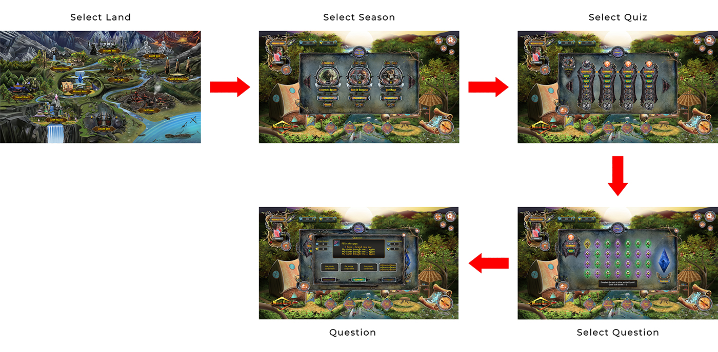
After we’ve agreed on the general styling, the first thing I’ve started working on was the tests module, because it’s the core part of the whole platform. I’ve created wireframes of the module and to test the first version of it, to make it easy to use, I’ve created a basic design with not the real data and created a HTML/CSS/JS prototype, where users can go through the whole flow of the tests, in this prototype I’ve integrated analytic tools (like Google Analytics and Hotjar) and tested it with the same school kids and the results of this test pleased me, because all types, design and flow was intuitive and easy for kids.
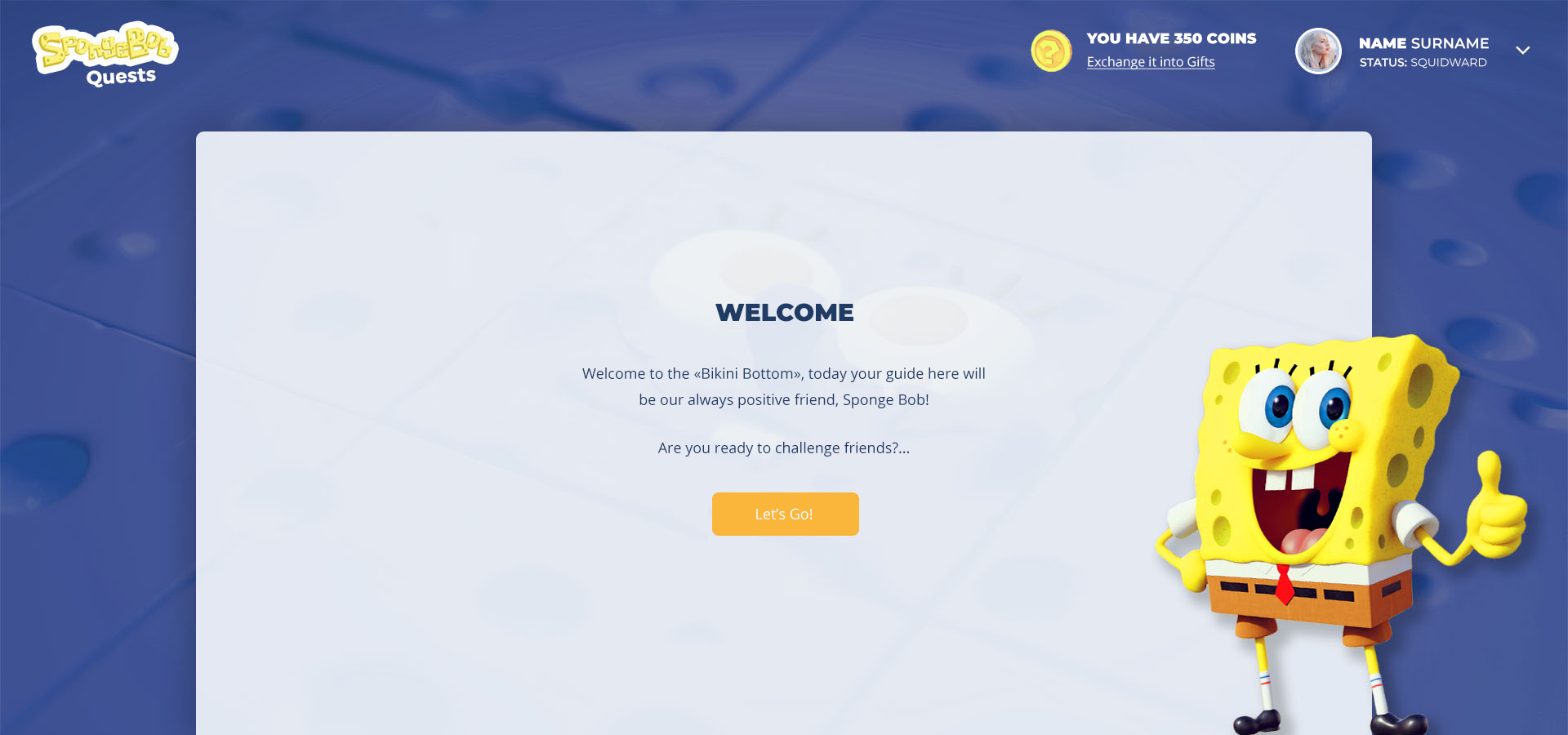
And here is what the very last design of the tests module looks like:
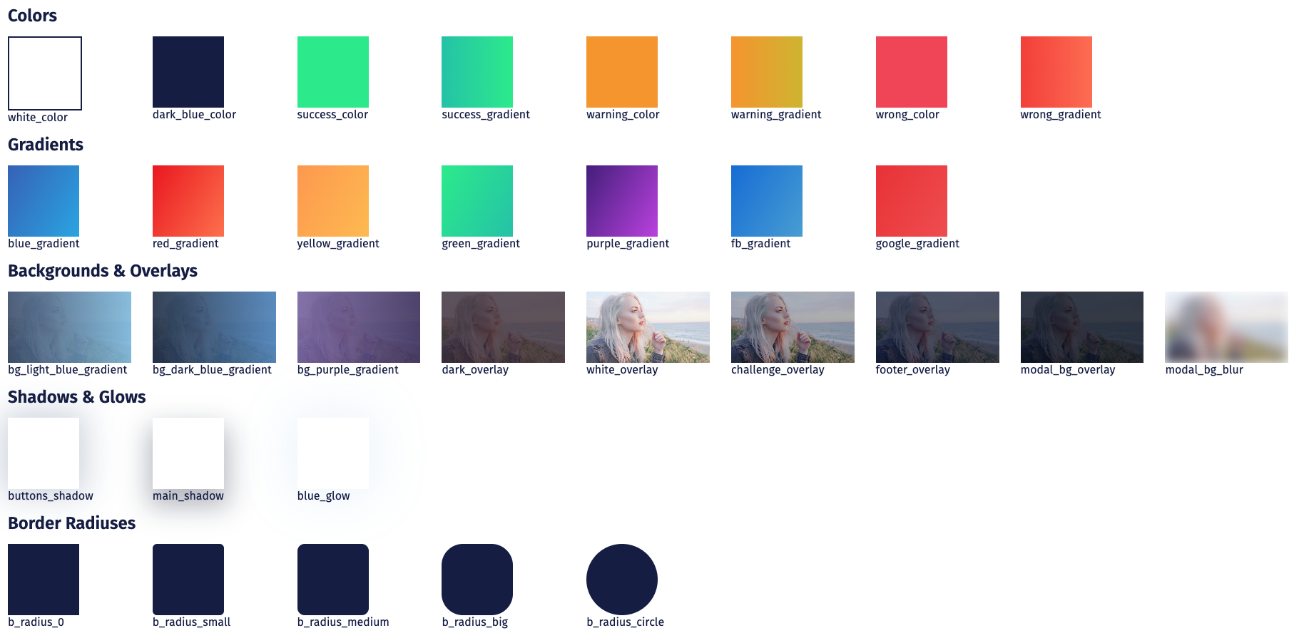
As a primary color I’ve selected blue and red, because these colors together are very mystical and pretty.
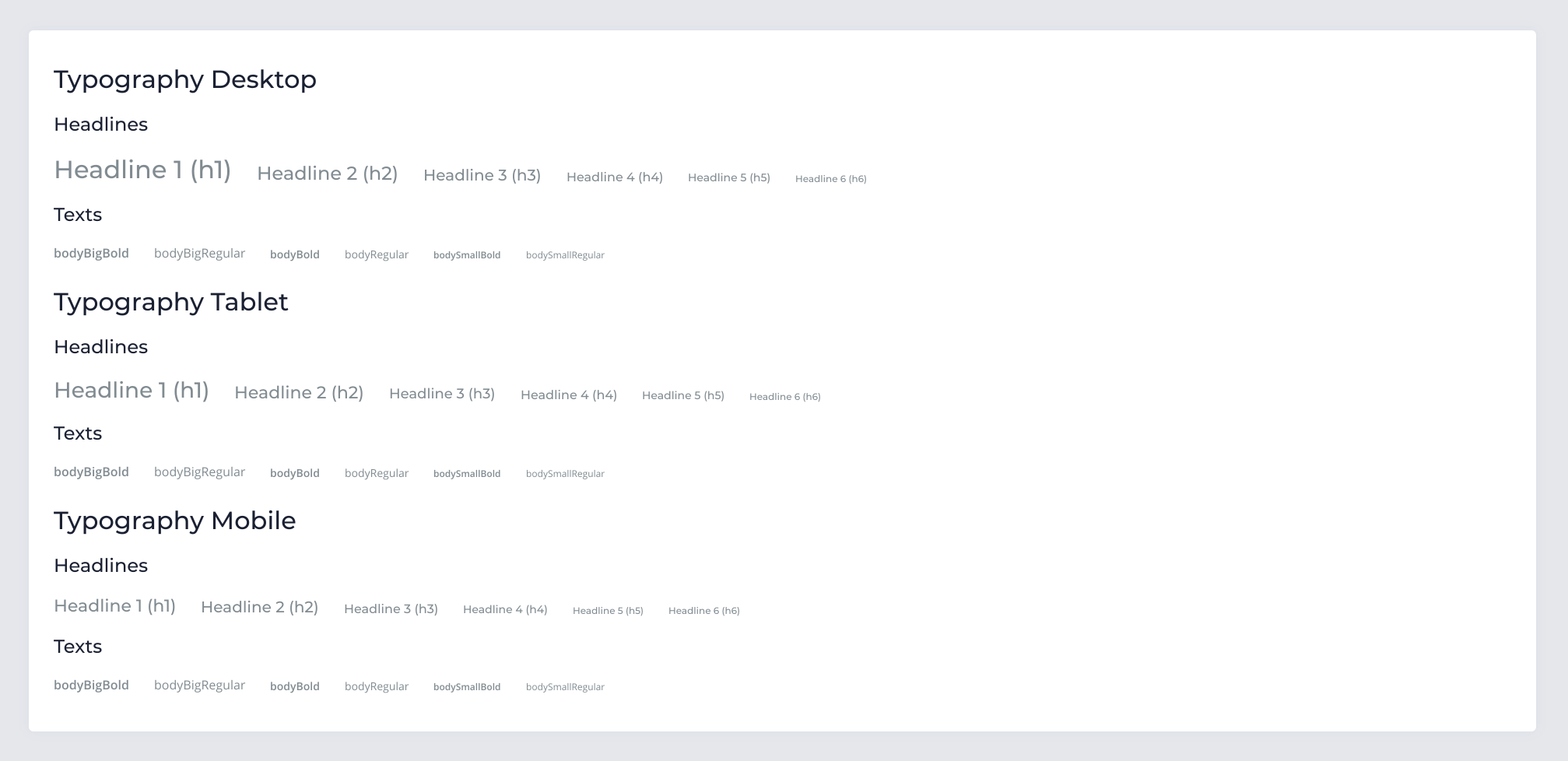
Open Sans was selected as the primary font-face, because of its good readability even on the very small sizes, its simple glyphs and the open source license, but for titles we’ve selected Montserrat family, because of simple, clean and pretty glyphs.
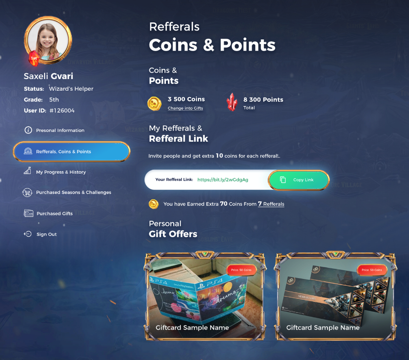
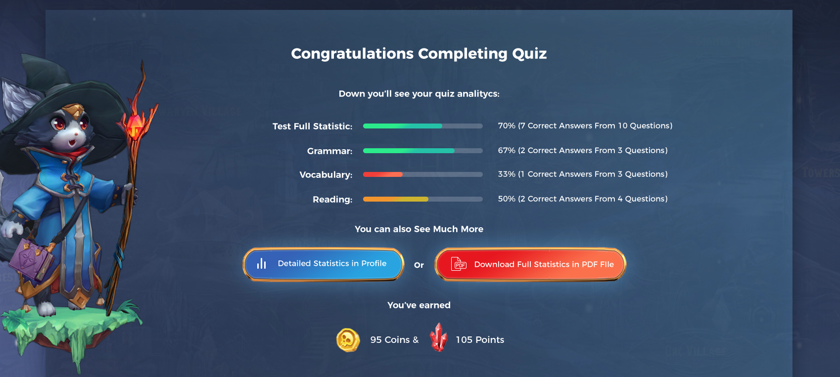
To make it more fun and for the extra engagement we’ve created coin/points system. User is awarded for the correct answers with coins based on the difficulty of the questions, also if the answer is not correct, user won’t lose anything, even if the pupil reads answer explanation, user will be awarded with the half of the correct answer coins. Later users can exchange those coins into the desired prizes by the platform partner companies, it gives platform extra income, partner extra advertising space and children are awarded for learning.
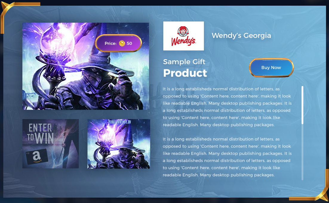
For extra engagement and also for spreading the word about platform, we’ve created referral system. Pupil/user can invite friend to platform and both will be awarded with extra coins, which they can use to “buy” gifts from the gift shop.
