
This isn't project's full case study, because of the NDA, also logo and data aren't actual.
As the company grows, the number & types of assets increase, making it difficult to manage them properly, which often leads to a lot of problems such as assets frequent damage, unplanned downtimes, etc. Which in itself increases expenses for the companies.
By simplifying and correctly receiving, processing and delivering data to the customer, it is possible to utilize the existing material-technical or physical-human base as accurately and fully as possible, which reduces time and nerve loss in employees. Which in itself means reducing company costs and increasing profits and making it even easier for companies to scale.

I've joined EAMS team, when they had a legacy, MVP system with some basic solutions working and they saw the opportunity to scale, they say that there was a tons of possibilities to optimize and automatize bunch of routines and make employee lives much easier, plus help companies to save more resources. In the very beginning, my role for this product was to develop and plan a design system (language) properly for better scaling, simplify/optimize existing ideas and data visualizations, but this product scaled and become a set of SaaS product solutions, we made it cross-platform, so I had to work on the UI Library not only for web, but also for the Android and iOS native applications, to develop platform appropriate solutions, which was a huge challenge and experience for me as a Product Designer.
In the first stage, together with the project manager, we've collected all the key features that the system would have (client companies will need), why there was a need of those features, what problems problems was the client experiencing, which has led them to us, how were those features working with other competitors, what were the main constraints with the legacy system, also we defined the user roles, who were going to use this product and for what, then we tried to break down and document each function in detail, identify users' problems and needs. In line with all this, in the first stage we divided the system into main modules and sub-modules and developed a corresponding general sitemap and user journey.
We then tried to make more detailed and descriptive break down for each key module and set of functions, specified user flows, ie what path the user would need to take to use each function.
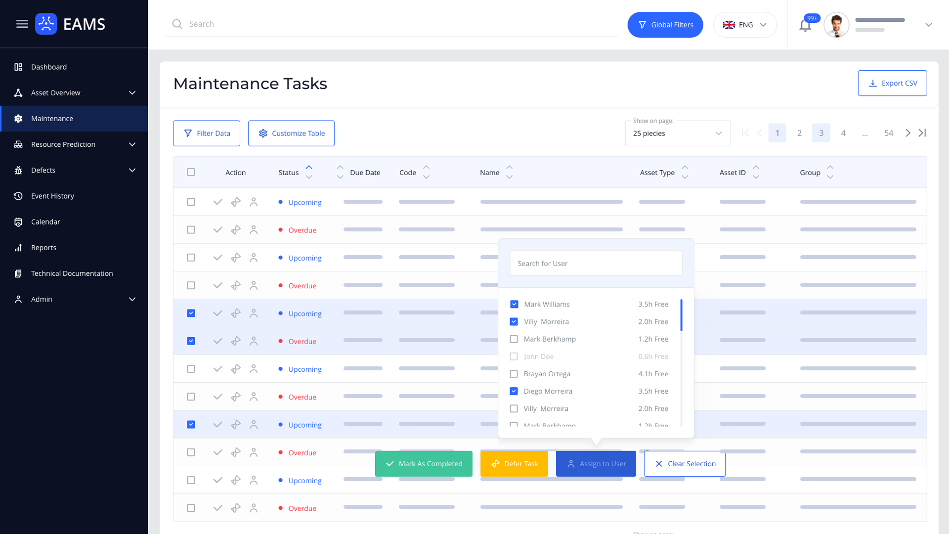
Since we knew that, the biggest part of the product (system) would be data tables, I've decided to start working on system interface with tables' design. I got one of the most data-loaded module and started working on table design for this data, adjusted it using the best practices and also developed some new approaches, but I'm not going to talk much about it, because there are tons of good articles about data table designs. (But if you want to hear more on what problems I've encountered, what I've learned / discovered and read something new, you can visit Medium and you'll find my article there about enterprise table design on touch native devices → Classic Tables vs Lists on Touch Devices)
When it comes to systemizing the design I’ve developed some approach which is similar to Atomic Design. I knew that this system would be more than a web product, so I’ve made a system foundations where we’ve colors, font-faces, etc and scaled system based on that.
As a primary color I’ve selected blue as it represents stability and loyalty, sky with full of opportunities and freedom.


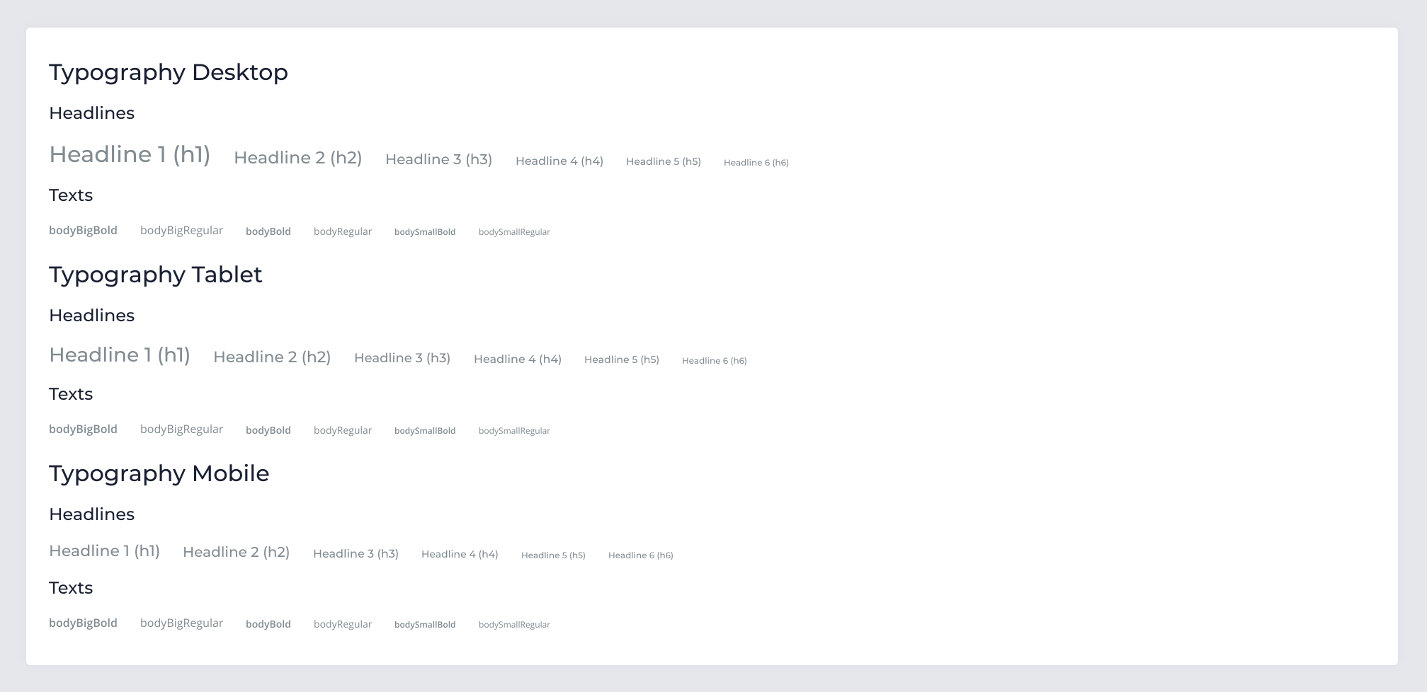
Open Sans was selected as the primary font-face, because of its good readability even on the very small sizes, its simple glyphs and the open source license, but for titles we’ve selected Montserrat family, because of simple, clean and pretty glyphs.
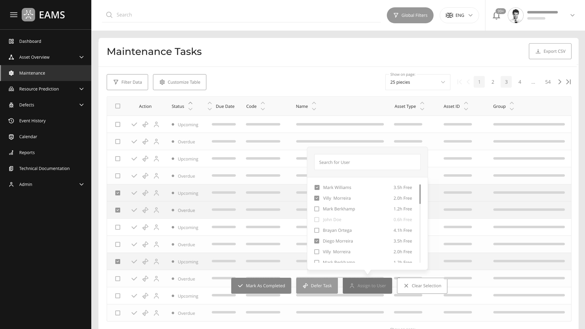
There are various of studies which have found, that 8% of digital product users are fully or partially color blind, so when I was working on secondary or tertiary (and especially on alert) colors I’ve made a big contrast between background colors and text colors which has to be written on it and also made a saturation contrast between all colors, made much important colors more to dark and less important ones more to light, because in this case even for fully color blind people it will be different and they can interact with the system as easily as the regular people.
When we’ve confirmed base design language and styling elements, I’ve decided to make wireframes for all the main modules (I’m going to write a bit more about some of the most important solutions slightly below) and after that I’ve started working on making design system elements and as a base library I’ve decided with the lead frontend engineer to took the Google Material Design.
Due to the uniqueness of the system, I’ve found that most of the icons we needed where unique and none of the icon packs were fully enough, also I’ve found out that compared to other icon packs I liked Material Icons more, but even though, I didn’t fully like it (in most cases it has not enough roundness for example), so I’ve decided to create an unique icon pack for EAMS using Material icon guidelines. In the end, I’ve created up to 200 unique icons for EAMS.
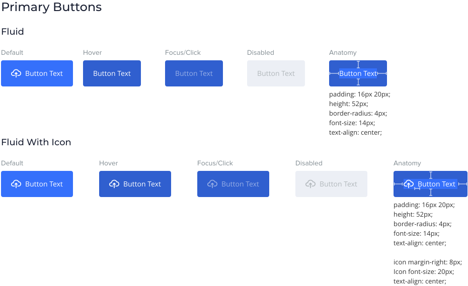
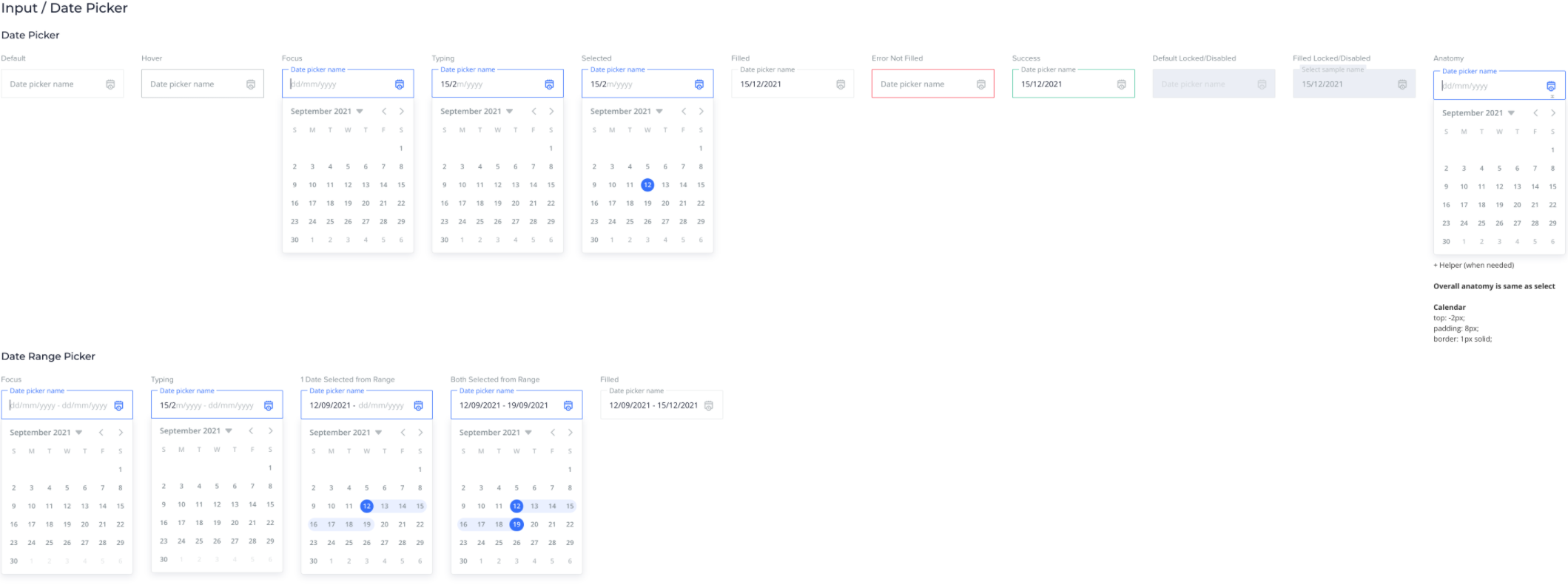
I’ve used 8 point grid alike approach for sizing, just I’ve started scaling from 2pt. When working on components, I’ve tried to have all states for each component and documented anatomy and styling of them, to be in sync with the developers and to make system seamless and standardized in current and future designs.


Export Interaction: As we’ve (me, pm and developers as a team) discussed, that we couldn’t get the exact time exporting a file would take, but could easily get approximate time and as we’ve tested this approximate time was about 3-5 seconds (the biggest file needed 6-7 sec and the smallest 1-2 sec, but mostly 3-5 sec), without an interaction, the user will be frustrated and will think that system has failed/crashed and:
With all this in mind, we decided to have a “fake loader” which was going to last for 3-5 seconds, it had no numbers and showed the user, that system has received his/her request, so the user would never could guess the loader was fake.

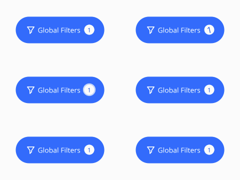
Global Filters Interaction: We had a feature called the “Global Filters”, it’s main idea is, that it filters all data though the system, so you apply it once and then when you go through the system everything is filtered based on that, before you clear it (for example if you select Motorola in the Manufacturer field, where you go in the system, everywhere, everything will be filtered with Manufacturer: Motorola). The main reason why this feature is needed is that, if company buys several things from one Manufacturer, (temperature, radio, gyroscope, etc), they need to find things easily and make the list of needed parts from simply selecting some “Global Filters”. These filters will be shown in container within the other filters as well, but since there could be too much basic filters applied, in some cases the user will be confused not getting if he/she has applied this filter on this page or is this a Global Filter, because of this, I’ve created an indicator for Global Filters when they are applied and it has this kind of animation to interact with the user and to show that the page is filtered globally.
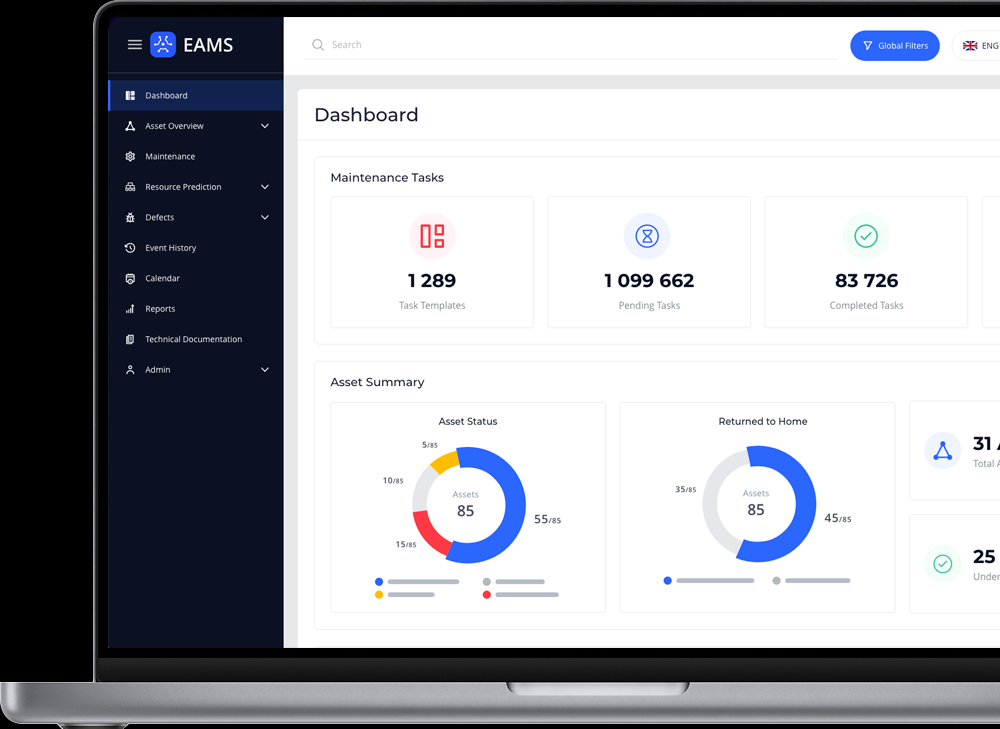
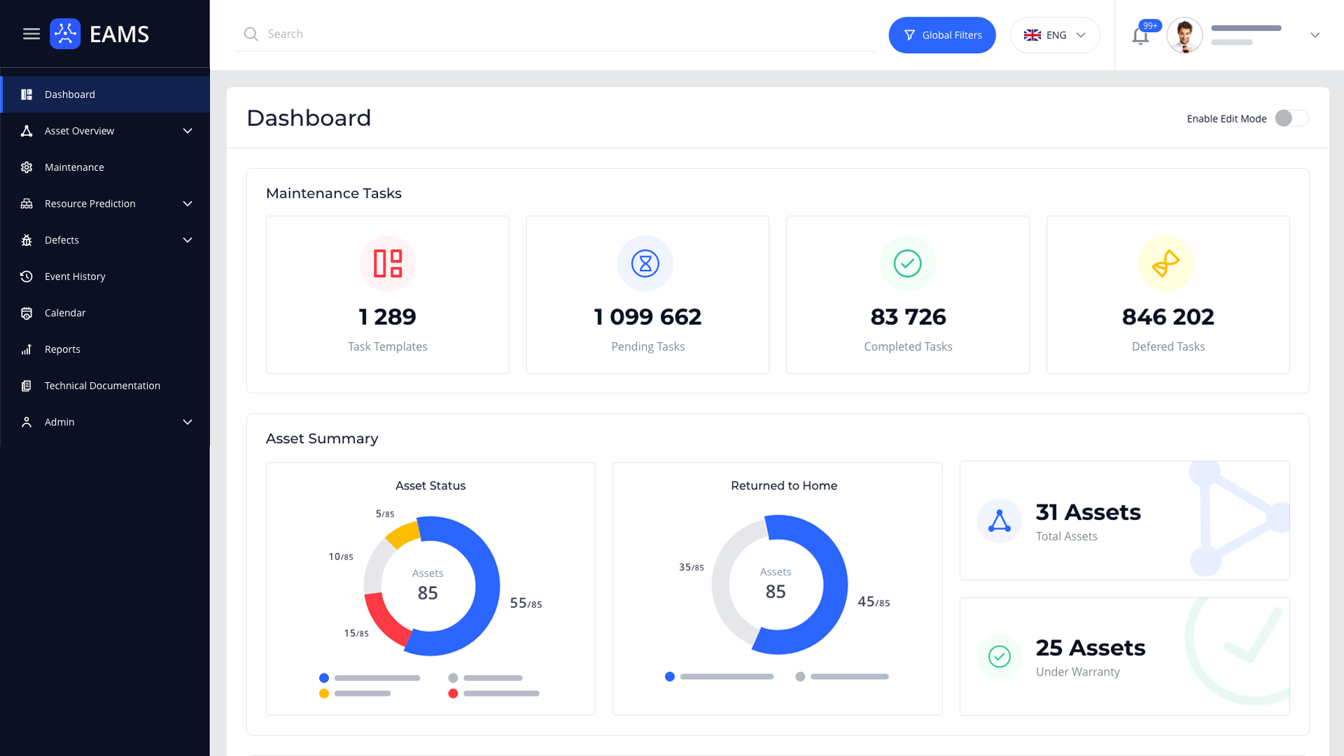
This is a landing page for the system user after log in, here that can have an overview of some assets and modules, also if this is a technical user or user who’s responsible of maintenance of the assets system show them asset statuses, defect informations, sensor indicator trends, etc. Also user can see how many assets they have, how many of them if free and how many busy, which ones are on the warranty and which aren’t, where each asset is by GPS and so on.
In the system, besides some functionalities, there is a defect generation and inspection form. This form has more than 300+ fields and they were filled by users on real papers, because of that there were tons of problems with filling them, managing and searching through them.
Studies have shown that people hate filling up the forms, they prefer to do nothing for hours rather than fill up a form that requires 10 minutes of their attention. The forms need to be simple and intuitive as well no one likes to fill them, more, people just hate filling them and it makes them angry and frustrated. Filling up a form requires a lot of physical and mental resources, especially when there is a form with 300+ fields...
Because of these things we’ve started researching a bit around those fields from multiple points:
As a step to simplify the form, I’ve determined what phases was a defect going through from discovery till it was resolved and documented. It gave us a possibility to divide the form to 3 steps:
It’s better, but still not the good, because 100 field on a page is still too much, so...
On the next step, we’ve determined (interviewed managers) which user roles were filling which fields, this made the view much clear, it turned out, that there are 8+ roles of the users which are working on registering and fixing a defect, so it gave us possibility to use wizard in a form and divide it to 8 steps:
Now each step has about ~40 fields instead of 300+, for the first glance it’s an amazing result, but...
I’ve tried to go deeper and to dived these ~40 fields in sub-steps, so user can fill it easily, data can be saved much often to avoid data loss, if system or computer/tablet on the user side has crashed, plus to show progress bars for the step to show how much he/she has left to fill up the step and to evoke emotions which result in positive user experiences.
So I’ve grouped related fields in sub-steps so, that maximum 10-12 fields where in one sub-step and showed progress to the user by sup-steps as well (how many sub-steps are filled and how many are remaining), this also gave us opportunity to validate and save data in background, plus I’ve added some UI animations for the emotional and time saving purposes and here is the result of it:
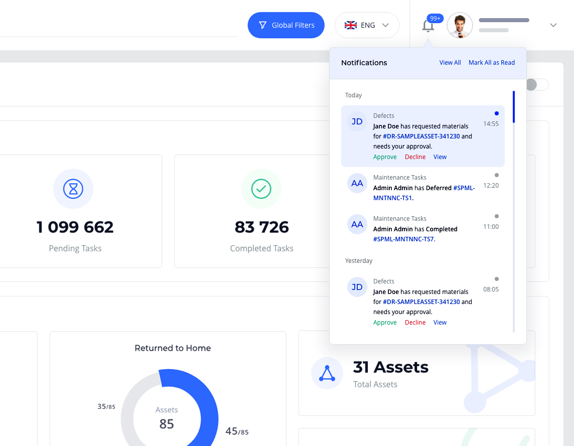
System and user revoked notifications some times can be very similar, also system can send tens of notifications to the user and in some cases user revoked notifications can have quick actions, because of these I’ve made a structure to standardize notifications. Standardized notification can be scanned by user much faster than cluttered one, he/she can understand the point much easier and make an action if needed. When user is onboarded in the system, uploading an image isn’t mandatory, so if user won’t upload a profile image, we’ll use user’s initials on the system color as a profile image.
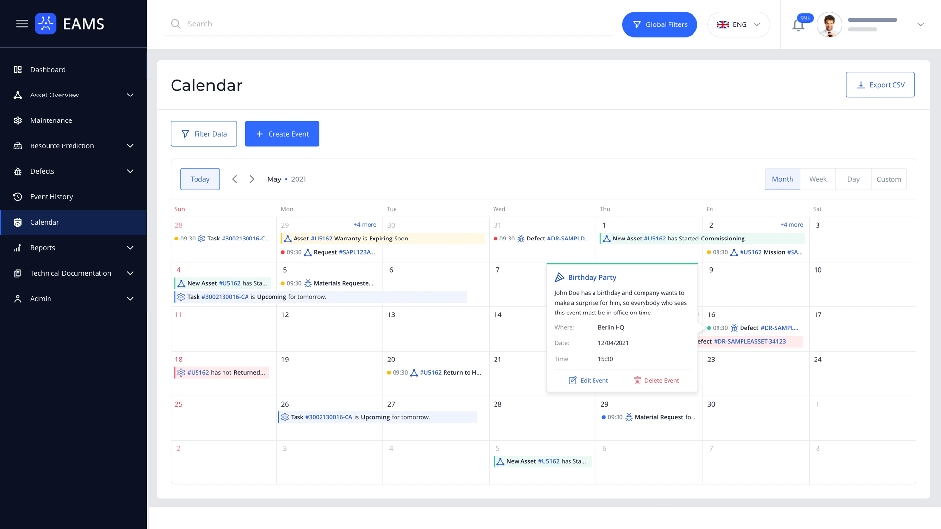
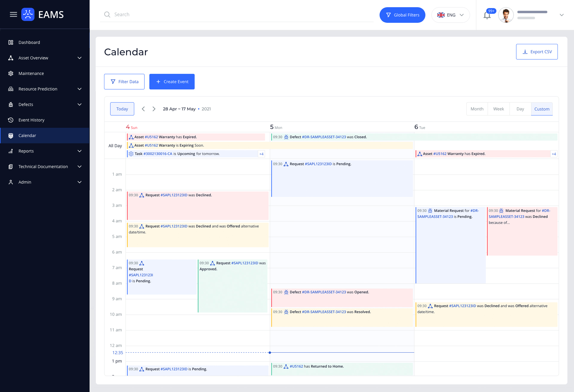
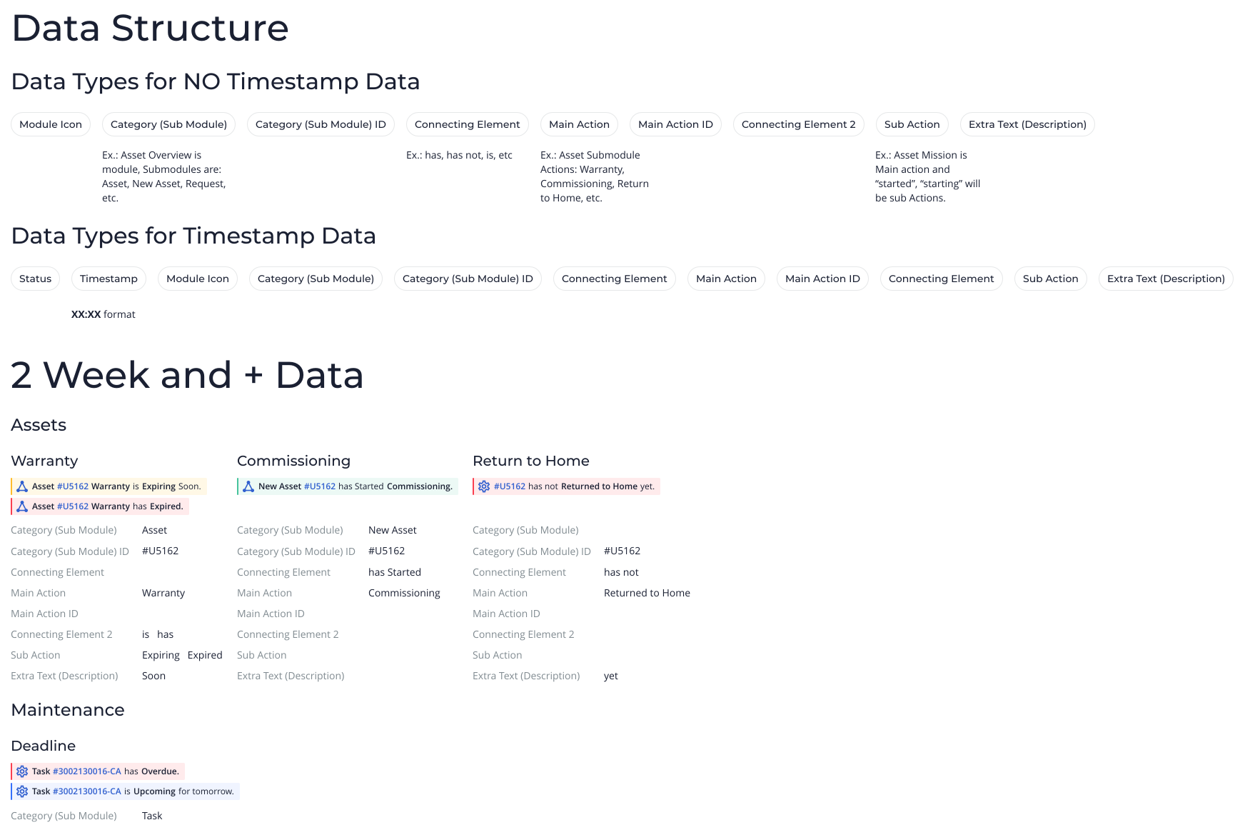
Everything in our reality and especially in the digital world is a subject of the time, so placing events (which was revoked by system or the user) on a calendar is a good thing from the visual representation perspective, plus it gives user and the company good time tracking and productivity management possibility. Because of that we’ve made a calendar module, but because there can be tons of events in the system, they need to be standardized. We’ve written down all the actions in the system which can cause events and I’ve worked on that data and it’s touch points to standardize events. In the end I’ve reduced it into the 4 types of structure, these 4 types can cover all system or user revoked events, plus gave an ability to create some basic events for outside the system if needed and here is the result of it:
